Solidarność Polish Underground Script Graphic
1980-1989 Polish Solidarity-era underground graphic register. Jerzy Janiszewski's hand-painted Solidarity script as the visual signature of a ten-million-member union.
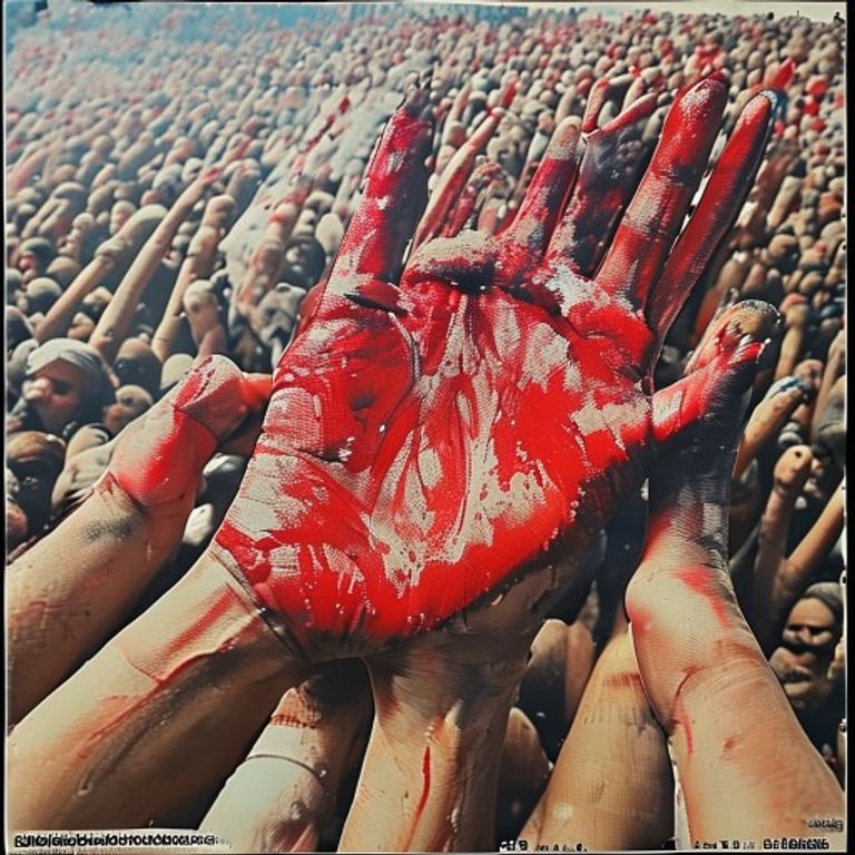
The prompt
Re-render this image in the visual register of Polish Solidarity-era underground graphic art (1980 through 1989, lineage of Jerzy Janiszewski's hand-painted Solidarność script and the broader bibula underground-press visual tradition). The defining graphic gesture: a hand-painted brush-script aesthetic that looks like a crowd of people leaning on each other, every letter or shape painted with a thick wet brush in red on white, the script visibly hand-made and human rather than typographically clean. Surface texture: cheap photocopier or risograph reproduction, smudged toner, fold creases, occasional staple-hole at the corner, the artifact of clandestine basement reproduction during martial-law restrictions. Palette restricted: thick brush-red on unbleached cream paper, with occasional black ink secondary element or smudged grey halftone. Subject treatment: solidaristic-collective, the figure rendered as one of many rather than monumental hero, often in a crowd or in a working pose, painted with the same brush gesture as the script (visible brush load, varied line weight, slight wet bleed at edges). Composition: subject occupying lower two-thirds with implied banner or script gesture above (rendered as abstract red brush-stroke rather than legible word), surrounded by white margin that reads as cheap paper rather than considered negative space. Mood: collective patient pressure, the underground press of a movement large enough to be impossible to suppress, the brush-stroke as the signature of ten million members. Strictly no on-canvas text, no legible Polish words, no Solidarność wordmark itself, no legible bibula publication names, no signature, no watermark, all script-gestures rendered as abstract brush-stroke shapes that suggest writing without spelling. Preserve the subject, pose, and composition of the source image exactly, change only the medium and rendering. Aspect ratio matches source.
What it is doing
Collins flying-column principle scaled to ten million people. Solidarność was too large to be a cell and too organized to be a mob, which made the regime's standard responses incompetent. Janiszewski's brush-script worked because it looked like a crowd, every letter leaning on the next, no industrial typographic cleanness available to the state-run press. The signature was un-counterfeitable because it was human, and the regime had nothing human to put against it.
Tuning knobs
- Period dial: `1980 Gdańsk shipyard founding` vs `1981 pre-martial-law open` vs `1983 underground martial-law` vs `1988 late roundtable era`
- Surface dial: `clean printed poster` vs `smudged photocopy bibula` vs `risograph hand-cranked basement run`
- Subject framing dial: `solo working figure brushed` vs `crowd suggested through repetition` vs `paired figures coordinated`
- Brush-script dial: `thick wet red brush stroke above figure` vs `script gesture as background field` vs `brush-stroke as banner held by figure`
- Palette dial: `red on cream only` vs `red and black on cream` vs `red on photocopy grey`
Style lineage
Learn the visual culture this draws from: Jerzy Janiszewski (graphic designer, Solidarnosc logo creator).
Related prompts
See all 33 prompts in the Guerilla grammar · Open in the gallery