PlayStation Jewel-Case Dark-Polygon Era Frame
The black-tray jewel-case PS1 package. Dark backgrounds, low-poly 3D renders, moody minimalism, the medium discovering it could be cinema. The CD-ROM era's most confident object.
The prompt
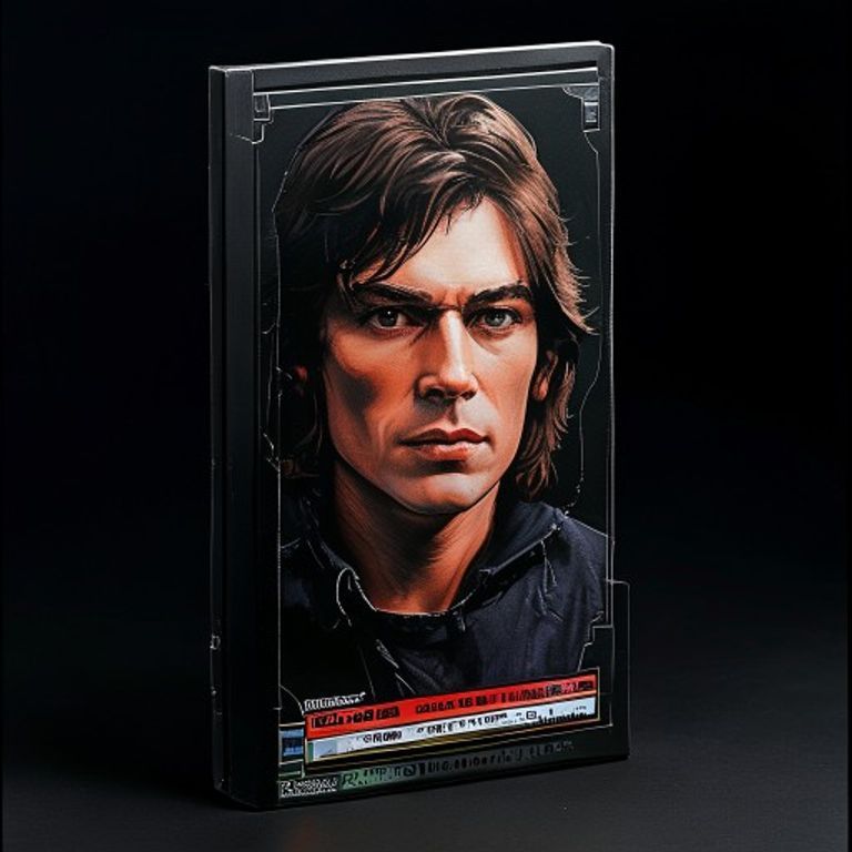
Re-render this image as a 1995 to 1999 original PlayStation video game package, the canonical black-tray jewel-case format used by Sony Computer Entertainment America and Europe. Package format: standard CD jewel-case dimensions (slightly larger than a music CD, the SCEA spec), clear polycarbonate front cover, black plastic tray visible inside (the signature dark-tray Sony chose against the music-industry transparent tray), printed paper insert visible through the front cover. Insert artwork: predominantly dark backgrounds (deep black, charcoal, ink blue, blood maroon), the moody minimalism the early CD-ROM era used to signal that games had become adult. Hero illustration: a rendered 3D image in the contemporary 1996 to 1998 in-game-engine register, low-polygon character or environment with visible polygon faceting, simple texture-mapping, hard-edged shadows, the early-3D look the medium had just unlocked. Top edge of the insert: a thin colored title-band stripe (render as a solid colored rectangle, no legible lettering). Bottom edge: a thinner band suggesting platform branding and rating mark (render as small colored rectangles). Side spine: a vertical strip visible through the jewel case, dark with a colored title strip. The case itself: clear polycarbonate with the classic four-pivot hinge, plastic slightly scratched from shelf wear, the black tray inside visible through the clear front. Print quality: 1997 offset litho, slight gloss varnish, registration tight. Mood: the medium discovering it could be moody, the package as the confident object that announces the medium has grown up. No on-canvas legible text, no logos, no franchise marks. Preserve the subject, pose, and composition of the source image exactly, change only the medium and rendering. Aspect ratio is standard PlayStation jewel-case vertical portrait (roughly 5:6).
What it is doing
The PS1 jewel case is the most underrated package format in consumer-software history. The black tray was a deliberate choice (Sony refused the music-industry transparent default). The dark moody insert grammar said: this is not children's entertainment anymore, this is a medium claiming maturity. The disc you held in your hand was fragile, finite, ownable, and stamped with a specific physical pressing. You could trade it, lend it, sell it back. The PSN-era download replaced this with a license that can be revoked. The jewel case is the medium at its most sovereign-object confident, the last format before the platform swallowed everything.
Tuning knobs
- Background-dark register: `pure black backdrop` (canonical-austere) vs `gradient charcoal-to-maroon` (atmosphere) vs `dark environmental scene` (cinematic)
- 3D-render era: `1996 hard-polygon faceted` (early-PS1) vs `1997 textured-mid-poly` (canonical) vs `1999 pre-rendered-cinematic` (late-cycle drift)
- Title-band dial: `thin solid color stripe` (canonical) vs `embossed-foil treatment` (special edition) vs `no band, full-bleed art` (deluxe variant)
- Tray-color dial: `black tray` (canonical SCEA) vs `transparent tray` (Japanese SCE variant) vs `red tray` (Greatest Hits reissue)
- Insert-finish dial: `glossy varnished` (canonical) vs `matte uncoated` (austere variant) vs `holofoil accent on title-band` (limited)
- Shelf-wear dial: `mint sealed` vs `light surface scratches on jewel-case` (lived-in) vs `cracked hinge + price-tag residue` (relic)
Style lineage
Learn the visual culture this draws from: Retro Game Cases.
Related prompts
See all 26 prompts in the Video-Game-Case grammar · Open in the gallery