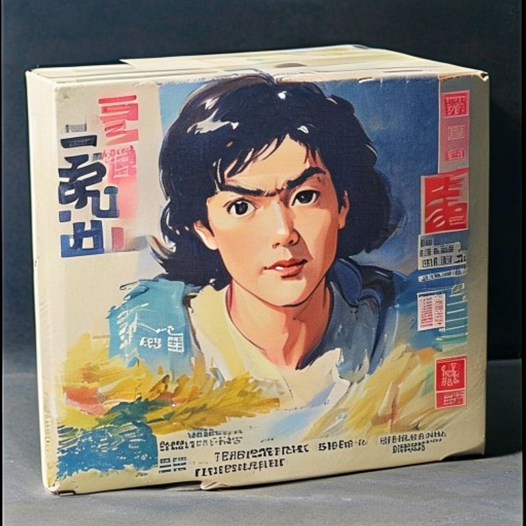
Famicom Japanese-Domestic Illustrated Cover Frame
The Japanese-domestic Famicom box. Painterly illustration, soft color, hand-drawn typography (suggested), the export's quieter and more confident cousin.
The prompt
Re-render this image as a 1985 to 1992 Famicom Japanese-domestic-market video game package, the small horizontal cardboard-box format used by Nintendo of Japan before the larger North American format was standardized. Box format: small wide rectangular cardboard box, horizontal aspect, glossy printed surface. Front face: full-bleed painted illustration in a soft Japanese commercial-illustration register, the kind of work seen on 1980s anime laserdisc sleeves and Famicom packages, watercolor and gouache mixed, soft color transitions, gentle lighting, no airbrush slickness, the illustrator's brushwork present in the highlights. Palette: subdued and confident (dusty rose, sage, ochre, slate blue, soft cream), not the saturated overload of the American market, a palette that trusts the viewer to lean in. Composition register: dynamic but composed, the illustration arranged as a small painting rather than a marketing scream, often a hero-figure framed with environmental context behind. Lower-left or top-strip: a colored band where Japanese title-typography would sit (render as a colored stripe with abstract calligraphic shapes suggesting kana and kanji, but NO legible Japanese lettering, no real characters, only abstracted brush shapes). Side spine: a thin colored band. Print quality: 1986 Japanese offset litho on coated boxboard, registration tight, soft matte finish with selective gloss on the illustration only. Mood: the domestic package as the honest cousin of the export, painted by an illustrator who treated the box as a small commission rather than a marketing emergency. No legible Japanese or English text, no franchise logos, no specific brand marks. Preserve the subject, pose, and composition of the source image exactly, change only the medium and rendering. Aspect ratio is Famicom horizontal box (roughly 7:5).
What it is doing
The Japanese-domestic Famicom box is what the medium looked like when packaging was a craft commission rather than a marketing-department deliverable. The American export had to shout across a foreign cultural distance; the domestic version could trust the buyer. The painted register, the soft palette, the small format: this is what consumer-software packaging looks like when the publisher respects the buyer's attention. Locklin would say: the export is the lie, the domestic is the truth.
Tuning knobs
- Painter register: `Yoshitaka Amano ethereal-watercolor` vs `Susumu Matsushita action-cartoon` vs `Naoyuki Katoh hard-edged-illustration`
- Palette dial: `subdued-jewel domestic` (canonical) vs `monochrome with single accent` (austere) vs `saturated-export variant` (rare crossover)
- Format dial: `small horizontal Famicom box` (canonical) vs `tall vertical Super Famicom transition` (later) vs `double-wide RPG box` (deluxe)
- Typography-suggestion dial: `kana brush-shapes only` (canonical) vs `kanji block-shapes only` (variant) vs `no typography hint at all` (deluxe)
- Print-finish dial: `matte with gloss-on-illustration` (canonical) vs `full gloss varnish` (later) vs `embossed-foil title-strip` (rare special-print)
Style lineage
Learn the visual culture this draws from: Bitmap Books.
Related prompts
See all 26 prompts in the Video-Game-Case grammar · Open in the gallery