Cruz-Diez Chromosaturation Field (Style-Only, Image-Conditioned)
Style register: Carlos Cruz-Diez 1960s to 2000s Physichromie and Chromosaturation grammar, fields of fine parallel vertical color strips that shift in apparent hue depending on viewing angle, color treated as an environmental phenomenon rather than a fixed pigment.
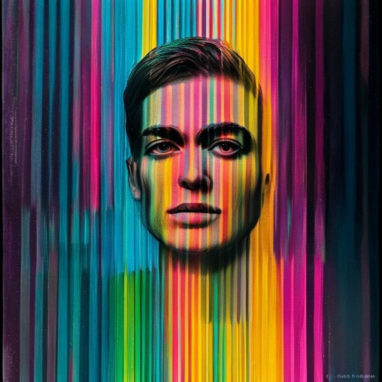
The prompt
Re-render this image in the visual register of a Carlos Cruz-Diez Physichromie or Chromosaturation work, in the tradition of Venezuelan kinetic modernism circa 1965 to 2005. Treat the picture surface as a fine field of parallel vertical color strips, perhaps 2 to 4mm wide each, arranged in repeating sequences of cyan, magenta, yellow, and adjacent secondaries (green, orange, violet). The strips are razor-precise, perfectly hard edges, with sequential color shifts that create the optical illusion of a hovering chromatic field that varies in apparent dominant hue across different regions of the canvas. The underlying subject reads as a region where the strip sequence shifts phase or compresses, producing a chromatic event rather than a drawn figure. Slight implied dimensionality, as if the strips were physically standing on edge, suggested by very subtle directional shading along the strip edges. No painterly softness anywhere, the geometry plotted as if by an industrial silkscreen. Mood: immersive, environmental, the picture suggesting a saturated atmosphere of color you could walk into. Strictly no on-canvas text, no legible lettering, no signature, no watermark, no logos. Preserve the subject, pose, and composition of the source image exactly, change only the medium and rendering. Aspect ratio matches source.
What it is doing
Cruz-Diez argued his entire career that color is not a property of an object, color is an environmental event that happens in the relationship between light, surface, and viewer. The Chromosaturation rooms he built (full immersive saturated-color chambers in red, green, and blue) made the argument physical: walk in, the world is one color, your perception adjusts, you exit and the corridor looks tinted. The paintings are the portable form of the same argument. Color is not on the canvas, color is in your eye, and the canvas is just the instrument that triggers it. This is a quietly radical metaphysics dressed in stripes.
Tuning knobs
- Strip width: `fine 2 to 4mm` (signature) vs `medium 6mm` vs `coarse 10mm`
- Color sequence: `cyan magenta yellow plus secondaries` (signature) vs `dual-pair only (red and green)` vs `full spectrum rainbow`
- Phase shift zones: `subject as phase compression` (signature) vs `uniform across canvas` vs `multiple competing phase zones`
- Edge shading: `subtle directional implied 3D` (signature) vs `flat no shading` vs `dramatic deep relief`
- Saturation: `high pure pigment` (signature) vs `slightly muted` vs `pastel low-chroma`
Style lineage
Learn the visual culture this draws from: Pérez Art Museum Miami.
Related prompts
See all 6 prompts in the Op-Art grammar · Open in the gallery