Bond Gunbarrel Graphic Silhouette
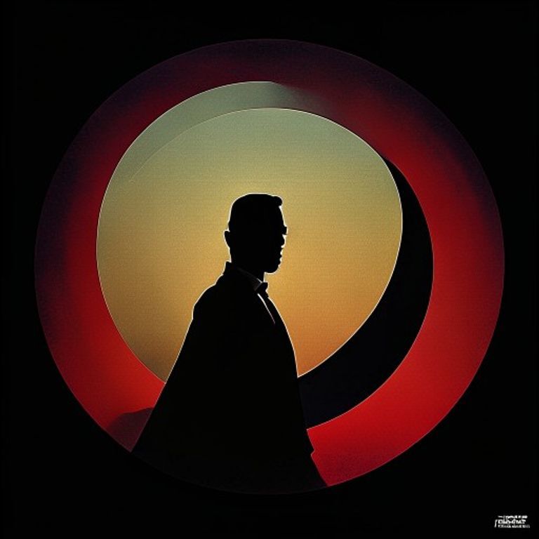
The 007 gunbarrel sequence and Maurice Binder title-design register. A single silhouette inside a circular aperture. The poster as license to enter the spectacle.
The prompt
Re-render this image in the visual register of James Bond gunbarrel-sequence and Maurice Binder title-design graphic art (1962 through 1980s, Dr. No through Licence to Kill era). A single subject silhouette rendered inside or against a circular aperture composition. The aperture itself is the primary graphic element: a clean dark circle or ring against a contrasting field, with the silhouette either centered inside the aperture, partially framed by it, or stepping across its edge. Silhouette treatment: pure black or near-black flat shape with no interior detail, occasionally a single sharp highlight on one feature, the rest reduced to confident outline. Background: a flat saturated color field (crimson, deep ultramarine, electric ochre, or a graduated dawn-sky vertical gradient), no photographic detail, no texture beyond a clean print register. Composition holds the aperture confidently in upper or center frame, with the subject occupying the lower interior of the aperture or breaking its lower edge, large negative space surrounding. Optional secondary element: a single diagonal of color suggesting motion, blood drip, or descending line crossing the field. Mood: confident menace, glamorized violence at a graphic remove, the spectacle invited rather than depicted. Strictly no on-canvas text, no 007 logo, no Bond title typography, no legible lettering, no signature, no watermark. Preserve the subject, pose, and composition of the source image exactly, change only the medium and rendering. Aspect ratio matches source.
What it is doing
The gunbarrel opening was a contract: the audience accepts that they will watch a man kill people for ninety minutes because the aperture frames it as ritual. Bernays would call it the engineered symbol that licenses what follows. The silhouette inside the circle is permission, not just decoration. Strip the typography away and the contract still holds, which is why the form survives every reboot.
Tuning knobs
- Aperture dial: `centered full circle` vs `partial arc from upper edge` vs `aperture broken at lower frame`
- Palette dial: `crimson on black` vs `cobalt on cream` vs `ochre-to-black graduated`
- Silhouette detail dial: `pure black flat` vs `single highlight on face or weapon` vs `silhouette with one interior color plane`
- Secondary element dial: `clean aperture only` vs `diagonal motion line` vs `blood-drip vertical`
- Era dial: `1962 Dr. No early` vs `1969 Lazenby cool` vs `1977 Spy Who Loved Me peak graphic`
Style lineage
Learn the visual culture this draws from: Men's Journal.
Related prompts
See all 34 prompts in the Movie-Poster grammar · Open in the gallery
Get the free sample. The intro plus the first three chapters of The Liberation Engine, delivered as a PDF. The full book and the complete 557-prompt method are the paid edition.