Movie-Poster / Style prompt
Criterion Arthouse Minimal Design
The Criterion Collection cover register (post-2000 era, conceptual graphic abstraction, evocative photography, disciplined typography). Restraint as taste signal. Negative space as authority.
Customize this prompt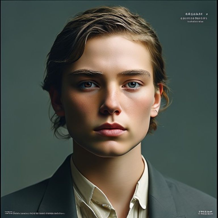
The prompt
Re-render this image in the visual register of contemporary Criterion Collection cover art (post-2000, with conceptual imagery, restrained typography, and evocative photographic art direction). Restrained, minimal, taste-coded design that treats the cover as a piece of standalone graphic work rather than marketing. Subject rendered with one of these approaches: a tight crop on a single charged detail, a flat illustrated reduction in a limited palette, a single high-quality still treated with painterly color regrading, or a single iconographic shape on a confident color field. Palette restrained: two or three colors maximum, often muted (dusty rose, sage, slate, cream, oxblood, charcoal, ochre) with one quiet accent. No saturation overload, no airbrush, no painterly excess, no photographic clutter. Composition uses dominant negative space, often 60% empty, with subject anchored against a single confident edge or center. Typography zone reserved at top or bottom, kept empty, the white margin treated as architecture. Texture: clean offset-print register, subtle paper grain, occasional risograph dot texture in the flat fields, never glossy, never overworked. Mood: arthouse seriousness, the cover as canonization rather than promotion, restraint reading as quality. Strictly no on-canvas text, no Criterion logo, no spine text, no legible lettering, no title, no signature, no watermark. Preserve the subject, pose, and composition of the source image exactly, change only the medium and rendering. Aspect ratio matches source.
What it is doing
Criterion built a brand on the inverse of grindhouse logic: instead of selling promise, withhold it. The cover refuses to tell you what the film is, which is itself an argument that the film is too important to summarize. Lansdale would recognize the move as hearts-and-minds at the cultural-prestige tier. The audience is recruited by being trusted with restraint.
Ways to change it
Pick any of these in the gallery and the choice is added to the prompt you copy.
- Approach dial: tight detail crop vs flat illustrated reduction vs painterly still regrade vs single iconographic shape
- Palette dial: muted earth and cream vs cool slate and oxblood vs monochrome plus one accent
- Negative space dial: 40% empty vs 60% empty vs 80% empty
- Surface dial: clean offset vs risograph dot texture vs subtle paper grain
- Emotional charge: small subject in a vast pale field, sage and cream, gaze averted (signature) vs tight crop on eyes or hands, oxblood and charcoal, hard shadow cutting across vs deadpan subject beside one absurd oversized prop, off-kilter crop, ochre accent
Style lineage
Learn the visual culture this draws from: Criterion Collection official site.
Related prompts
See all 34 prompts in the Movie-Poster grammar