Tabloid Newsstand Sensational
The tabloid cover as pure commodity. Shock and appetite rendered in color, every mechanism deployed to stop you at the newsstand.
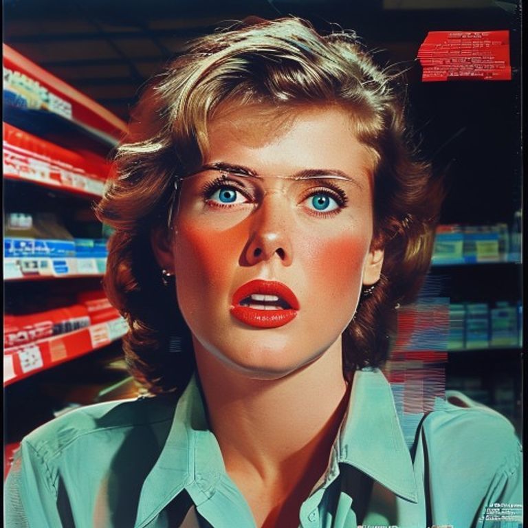
The prompt
Re-render this image as a supermarket tabloid magazine cover, circa 1970s to 1990s, rendered with the visual intensity and commercial cynicism that defined the genre. Subject is photographed or illustrated with maximum emotional impact, often cropped tightly to the face or moment of crisis, the expression extreme (shock, fear, desire, loss). Photography: high-contrast color, often slightly oversaturated, the kind of print quality where the ink sits on top of the paper rather than absorbing into it. The subject may be lit harshly to maximize texture and impact, or the image may be doctored with obvious crossing-out marks, arrows, or visual punctuation layered on top. Color palette: hot reds, electric blues, flesh tones cranked to maximum saturation, the photograph screams rather than whispers. Masthead area: enormous text rendered as solid color block, multiple colors intersecting, no legible lettering. Cover headline areas: multiple overlapping solid-color bars, different sizes suggesting shouted urgency, no readable words. Barcode area: rendered as a solid dark block. Secondary coverlines: scattered solid bars of contrasting colors. Small images in corners: rendered as solid color blocks or simple shapes. The composition is chaotic, the eye has nowhere to rest, everything is competing for attention. Paper stock is cheap, slightly porous newsprint, the tactile feeling of something disposable. Aspect ratio 5.5:8.5 portrait, standard supermarket tabloid size. Preserve the subject, pose, and composition of the source image exactly, change only the medium and rendering.
What it is doing
The tabloid cover is the last honest place in magazine publishing. It does not pretend to document or analyze. It does not hide behind design restraint. It screams. The subject is rendered at the moment of maximum emotion, maximum crisis, maximum audience arousal. The overexposure, the saturation, the layering of text and punctuation on top of the image, all conspire to create a cognitive cascade: something is wrong, something is happening, something is forbidden, and you can read about it for a dollar-ninety-nine. The tabloid understood that the newsstand is a marketplace and the cover is the competition. Every other magazine is trying to convince you that you need information, sophistication, or aspiration. The tabloid is trying to convince you that you need to know this right now, before anyone else does, before it becomes old news. The paper quality is bad on purpose. The ink sits on top of the fiber. The colors are false. The urgency is manufactured. None of that matters. You buy it anyway.
Tuning knobs
- Color-saturation dial: `oversaturated fever-dream` vs `high-contrast primary colors` vs `lurid fluorescent intensity`
- Subject-expression dial: `shock or fear extreme` vs `moment of crisis caught` vs `desire or forbidden exposure`
- Image-overlay dial: `clean photograph with layered text blocks` vs `obvious doctoring visible` vs `collaged elements stacked`
- Typography-chaos dial: `multiple overlapping color blocks` vs `organized but dense` vs `competing sizes and shapes`
- Paper-quality dial: `glossy cheap tabloid newsprint` vs `matte pulp stock` vs `slightly aged yellowed paper`
- Emotional-register dial: `maximum shock impact` vs `scandal and betrayal` vs `forbidden knowledge revealed`
Style lineage
Learn the visual culture this draws from: Tabloid journalism (sensationalist newsstand format).
Related prompts
See all 7 prompts in the Magazine-Cover grammar · Open in the gallery