National Geographic Yellow-Frame Field
The yellow frame as the border of discovery. Something wild and documented, seen as if for the first time by Western eyes.
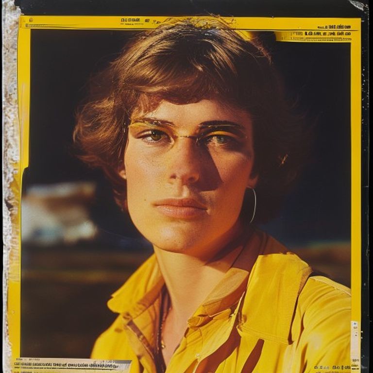
The prompt
Re-render this image as a National Geographic magazine cover, circa 1980s to 1990s field documentation aesthetic. Composition: subject (person, place, or animal) fills most of the frame, lit by natural or golden-hour daylight suggesting location authenticity. The iconic yellow border frames the image on all four sides: a thick, butter-yellow rectangle, roughly quarter-inch width, rendered as if printed directly on the transparent cover stock. The photograph itself employs saturated color film stock (Kodachrome era), warm color palette with deep shadows and luminous highlights, the kind of transparency that made National Geographic's printing legendary. Sky is vivid, earth tones are deep and warm, subject rendering is rich in detail and texture. Masthead area: solid yellow or tan color block at top, no legible lettering. Cover date and issue information areas rendered as thin solid-color bars, no readable text. The photograph itself is pin-sharp, with depth of field rendering foreground and background in crisp detail. Surface: glossy magazine stock, slight specular reflection visible. Aspect ratio 8.5:11 portrait, or 11:8.5 landscape if subject demands it. Preserve the subject, pose, and composition of the source image exactly, change only the medium and rendering.
What it is doing
National Geographic made the world a catalog. The yellow frame was not a design choice, it was a contract: what you see inside this border is real, documented, and seen through the eyes of a Western scientist-explorer who has traveled to verify it. The yellow became so synonymous with discovery that the magazine could print nothing else on that border, no words needed. The color itself said: this is the truth-machine, this is credibility, this is the world before your eyes. The saturation of the color film, the clarity of the depth of field, the control of the lighting, all conspire to make the place or subject look more vivid than actual life, more real than real. That is the promise and the lie of National Geographic. Everything inside the yellow frame becomes specimen, becomes knowledge, becomes the property of the viewer. The world is flat and containable if you have the right camera and the right film.
Tuning knobs
- Color-stock dial: `Kodachrome saturated` vs `Fujifilm warm-shadow` vs `Ektachrome cool-clear`
- Frame-weight dial: `thick quarter-inch yellow` vs `thin eighth-inch yellow` vs `accent yellow top-bottom only`
- Subject-scale dial: `tight detail of texture or creature` vs `landscape vista with subject centered` vs `environmental portrait with context`
- Light-direction dial: `golden-hour sidelit glow` vs `overhead equatorial harsh` vs `diffuse overcast documentary`
- Masthead-color dial: `warm tan` vs `bright yellow match` vs `muted beige`
- Depth-of-field dial: `pin-sharp near-to-far` vs `selective focus subject sharp` vs `slight atmospheric haze`
Style lineage
Learn the visual culture this draws from: National Geographic (yellow frame logo 1959-present).
Related prompts
See all 7 prompts in the Magazine-Cover grammar · Open in the gallery