Magazine-Cover / Style prompt
Vogue High-Fashion Editorial
The fashion cover as the human rendered as pure surface. Light, pose, fabric, the body erased into elegance.
Customize this prompt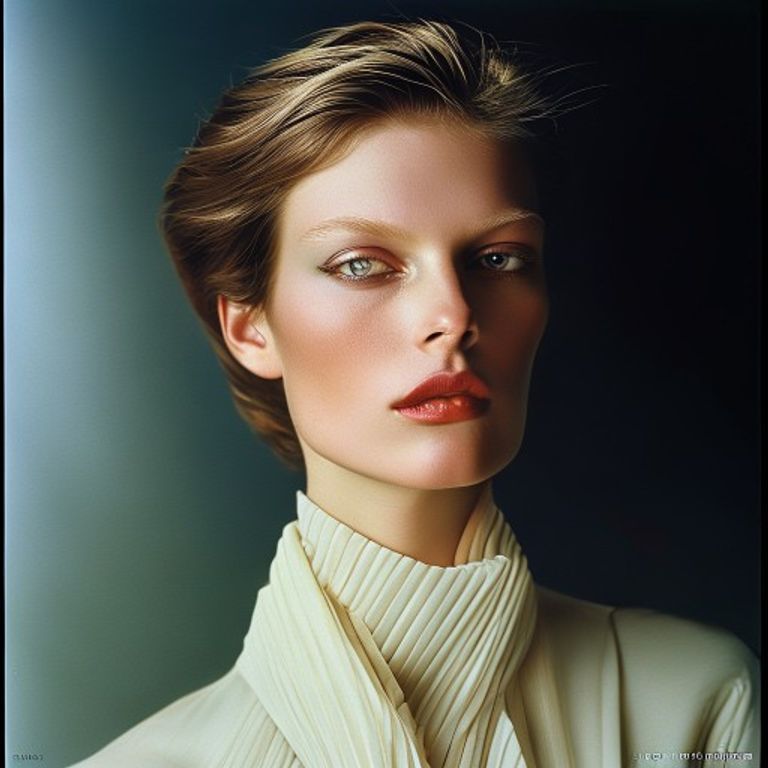
The prompt
Re-render this image as a Vogue magazine cover, circa 1980s to 2000s high-fashion editorial photography. Lighting: studio-controlled, often sidelit or three-quarter, emphasizing geometry and volume. Subject rendered as pure form and fabric, skin and clothing treated with equal weight as surfaces. The pose is architectural, the body angled to create diagonal lines across the composition, the face often partial-profile or eyes-away-from-camera, creating distance rather than connection. Color palette: restrained, often biased toward one or two dominant hues (jewel tones, pastels, or monochrome with accent), the rest of the composition negative space. The fabric of clothing is hyper-sharp, every weave and drape visible, treated as sculpture. Skin rendering is luminous but matter-of-fact, no emotion, just surface. Hair is styled as structural element, not hair as human signifier. Masthead area (top): rendered as solid block in brand color, no legible lettering. Cover date and edition area: thin lines or blocks, no readable text. Background: often pure white, subtle gradient, or single-color field, the composition is not cluttered with information, it is austere. Finish: high-gloss magazine stock, photograph is often retouched to near-perfection, skin flawless, every element controlled. Aspect ratio 8.5:11 portrait. Preserve the subject, pose, and composition of the source image exactly, change only the medium and rendering.
What it is doing
Vogue rendered the human body as an abstract form. The person was the least interesting thing in the composition. What mattered was the line the body made in space, the way the fabric fell, the geometry of the pose. The subject was not a person, it was a surface on which to display. Emotion was a defect to be retouched away. The eyes looked away from the camera, the mouth was neither smiling nor frowning, the body was a proposition for geometry, not for connection. The fashion itself was sculpture. The lighting was controlled to within a millimeter. The retouching was so precise that the image looked more real than life. Vogue created a standard of beauty that was not interested in beauty as a human quality, but as a design problem to be solved. The cover was the temple in which that solution lived.
Ways to change it
Pick any of these in the gallery and the choice is added to the prompt you copy.
- Pose-orientation dial: profile or three-quarter angle vs full frontal architectural vs dynamic diagonal composition
- Color-discipline dial: monochrome with single accent vs jewel-tone dominant vs high-key pastels
- Skin-finish dial: flawless retouched airbrushed vs naturalistic with texture visible vs matte porcelain finish
- Fabric-emphasis dial: fabric as primary subject vs figure and fabric equal weight vs figure dominant, clothing secondary
- Background-treatment dial: pure white void vs subtle gradient vs single solid color field
- Emotional-register dial: cool distant eyes-away vs subtle inner life vs direct confrontational gaze
Style lineage
Learn the visual culture this draws from: Vogue magazine (high-fashion editorial).
Related prompts
See all 7 prompts in the Magazine-Cover grammar