Magazine-Cover / Style prompt
Fortune/Esquire Editorial Illustration
The mid-century executive rendered as national icon. Illustration over photograph, the suit as American armor.
Customize this prompt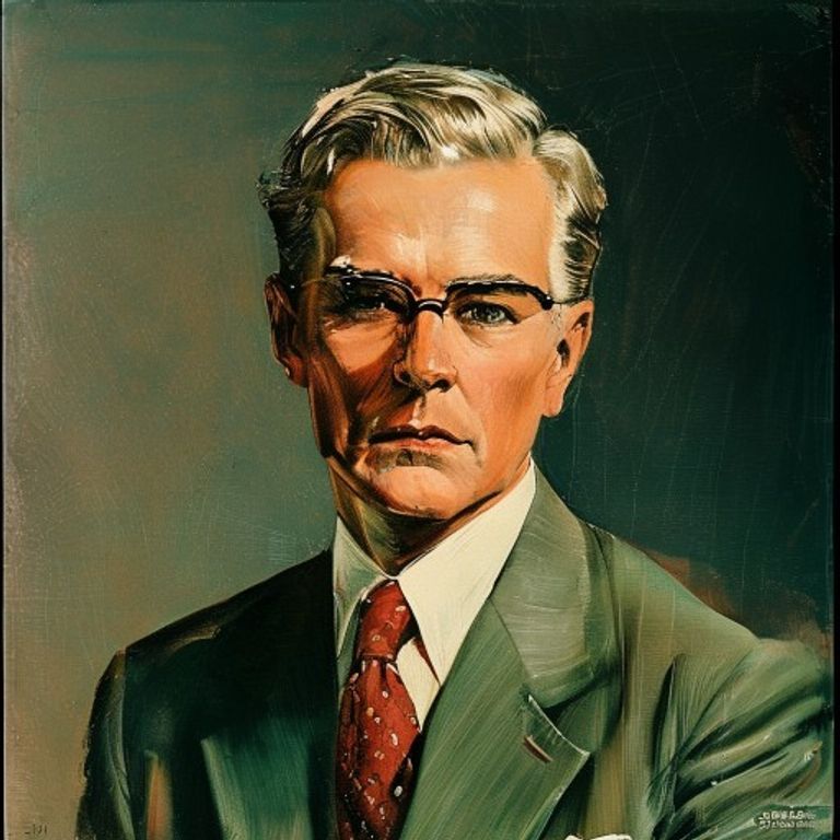
The prompt
Re-render this image as a Fortune or Esquire magazine cover, circa 1950s to 1970s, illustrated in the editorial portraiture tradition of that era. Medium: oil on canvas or tempera, finished with enamel precision. Subject rendered as a business executive, entrepreneur, or cultural figure of the era, posed with the confidence of someone accustomed to authority. The illustration style is representational but refined, every detail considered, the kind of portraiture that appears in corporate boardrooms. Hair is sculpted, the suit is rendered with architectural precision showing fabric weight and drape, the face is idealized but recognizable, the eyes are assured. Color palette: warm earth tones, deep greens or burgundies in background, the figure set against a subtle field or corporate interior suggested with minimal lines. The lighting is sculptural, emphasizing form and solidity, creating a sense of mass and presence. The composition is often three-quarter or full-length torso, sometimes with a small background detail (office window, map, plant) suggested rather than fully rendered. Masthead area: rendered as text-free solid block or tone, no legible lettering. Cover lines and date information: thin horizontal or vertical bars, no readable text. The overall impression is authority and certainty, the era when American business felt like destiny. Surface: matte finish, the illustration is crisply printed, the quality of the printing is evident. Aspect ratio 8.5:11 portrait or 11:8.5 landscape. Preserve the subject, pose, and composition of the source image exactly, change only the medium and rendering.
What it is doing
Fortune and Esquire made the executive into a god. The illustration format, the precision of the rendering, the architectural composition, all signaled one thing: this person has transcended the ordinary and arrived at a higher order of being. The suit was not clothing, it was armor. The office was not a room, it was a kingdom. The confidence in the eyes was not personality, it was inevitability. These were the men who were building America. The magazine knew it. The illustrator knew it. You, the reader, were meant to know it too. The mid-century executive was the closest thing America had to a hereditary aristocracy, and these magazines were the court painters. The illustration style, with its oil-on-canvas finish and meticulous detail, was a statement that this person was significant enough to warrant the slow work of painting, not the snapshot of photography.
Ways to change it
Pick any of these in the gallery and the choice is added to the prompt you copy.
- Illustration-medium dial: oil-on-canvas realistic vs tempera corporate-precise vs gouache editorial-clean
- Background-environment dial: corporate office corner vs suggested landscape or geography vs pure neutral field
- Pose-authority dial: seated power-position vs standing confident vs three-quarter profile thoughtful
- Color-palette dial: deep burgundy-green-gold vs earth-tone muted vs cool blue-gray authority
- Detail-specificity dial: meticulous every-thread detail vs confident loose brushwork vs clean simplified forms
- Persona register: dark three-piece suit, arms crossed, chin raised, boardroom window behind (signature) vs tweed jacket and knit tie, book in hand, tall bookshelves behind vs rolled shirtsleeves, loosened tie, weathered hands, factory smokestacks behind
Style lineage
Learn the visual culture this draws from: Fortune and Esquire (executive illustration format).
Related prompts
See all 7 prompts in the Magazine-Cover grammar