New Yorker Illustrated Cover (Wry)
The New Yorker cover as the educated smirk at power. Rendered as watercolor and line, the drawing laughing quietly at something the subject cannot see.
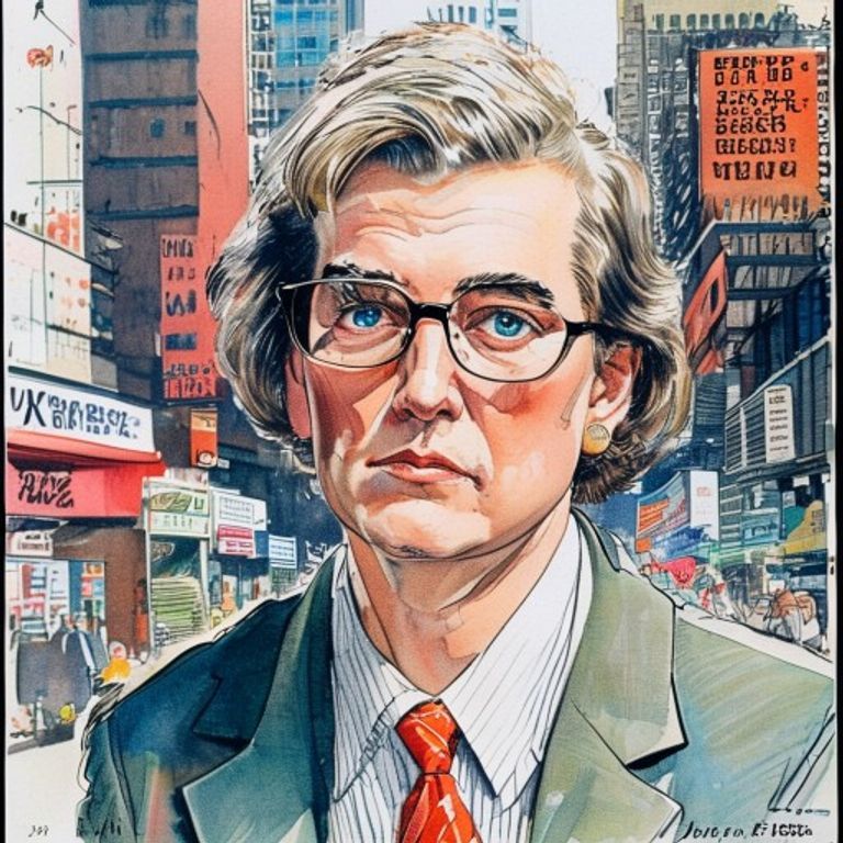
The prompt
Re-render this image as a New Yorker magazine cover, circa 1970s to 1990s, illustrated in the style of the publication's satirical tradition. Medium: watercolor on paper or gouache, with fine pen-and-ink line work overlay for definition. Subject rendered with caricatural exaggeration: features slightly distorted to suggest personality or folly, but not grotesque, rather amusedly observed. Color palette: muted, sophisticated, often limited to 4-6 colors with generous white space. The line work is fine, assured, the kind of drawing that suggests the artist has seen ten thousand of these before and is amused by this particular specimen. The composition is often crowded with small background details, sight gags, visual puns rendered in tiny scale (no legible text in those gags, just shapes and forms that suggest activity). Masthead area: thin sans-serif type rendered as a color block, not the actual word. Cover date and issue information: solid blocks or horizontal bar, no legible lettering. Background is often suggested with loose watercolor wash rather than fully rendered. The drawing has the precision of a trained illustrator who understands anatomy and form, but the wit of someone who thinks all authority is somewhat foolish. Aspect ratio 8.5:11 portrait. Preserve the subject, pose, and composition of the source image exactly, change only the medium and rendering.
What it is doing
The New Yorker cover is the one place in American mass media where it was permitted to laugh at power before power laughed back. The illustration format, the watercolor finish, the wry distance built into every line, all conspired to make the insult deniable. It was a drawing, not a statement. It was humor, not journalism. The magazine could publish the cover and if someone was offended, the artist could always claim misinterpretation. The caricature was affectionate, the wit was gentle, the insult was understated. This was the privilege of the educated middle class: to mock the powerful while remaining, fundamentally, in the club. The small background details, the sight gags, the visual puns layered into the composition, all signal one thing: you have to read closely to get the joke. If you don't get it, that is a statement about you, not the magazine.
Tuning knobs
- Illustration-style dial: `Arno-derived elegant` vs `Gahan Wilson grotesque-gentle` vs `Lorenz abstract-geometric`
- Watercolor-saturation dial: `rich color washes` vs `muted pastel restraint` vs `almost monochrome with touches`
- Background-complexity dial: `dense sight-gag layering` vs `simple suggestion with minimal detail` vs `empty white space focused on subject`
- Line-weight dial: `fine precise pen-work` vs `confident loose brushline` vs `delicate spiderweb detail`
- Caricature-degree dial: `gentle feature suggestion` vs `pronounced exaggeration` vs `almost grotesque-comic`
- Comedic-timing dial: `visual gag set up across composition` vs `subject oblivious to irony` vs `viewer alone in on the joke`
Style lineage
Learn the visual culture this draws from: The New Yorker (illustrated cover tradition since 1925).
Related prompts
See all 7 prompts in the Magazine-Cover grammar · Open in the gallery