Magazine-Cover / Style prompt
Time Red-Border Portrait
The Time magazine cover as rite of anointment: the week someone became historical. Red border, stark light, the person larger than their moment.
Customize this prompt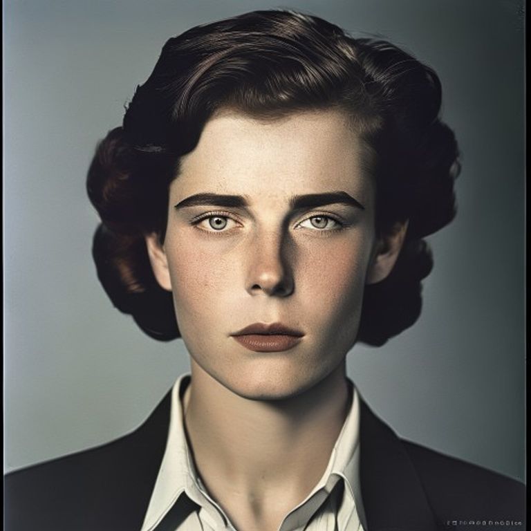
The prompt
Re-render this image as a Time magazine cover, circa 1960s to present-day photojournalism style. Background: pure white or pale gray, uncluttered. Subject: centered portrait, direct frontal or three-quarter gaze into camera, lit by stark key light creating deep shadow on one side of the face. The lighting is unflinching, every line and expression visible, no studio softness. Hair and facial features rendered with photojournalist precision, the kind of light a UPI photographer would use in a news bureau. The masthead area (top) rendered as a solid red or burgundy color block, no legible lettering. Cover date area: thin horizontal line or block in black, no text. Main coverline area below the portrait: 2-3 solid color blocks (navy, gray, white), no readable words. Photograph: high-contrast black and white photogravure, or matte color transparency stock if color era. Texture: fine halftone grain visible on close inspection, the paper stock is newsprint-adjacent, slightly glossy. Aspect ratio 8.5:11 portrait. Preserve the subject, pose, and composition of the source image exactly, change only the medium and rendering.
What it is doing
Time magazine created the format of anointment through portraiture. Every face on the cover became historical the moment it appeared. The red border is not design, it is consecration. The stark lighting, the white void around the subject, the complete removal of context, all signal one thing: this week, this person, mattered enough for America to look. The portrait is unflinching, often unflattering, because the job of Time was never to celebrate, it was to announce. You were on Time's cover because history happened and you were in it. The magazine made people, not the reverse. The red border turned any person into a maker of events, whether they were or not.
Ways to change it
Pick any of these in the gallery and the choice is added to the prompt you copy.
- Lighting era dial: 1960s key-light dramatic vs 1980s magazine studio vs 2010s naturalistic journalistic
- Border-weight dial: thick red border 1-inch vs thin red border quarter-inch vs no-bleed red frame
- Coverline-blocks dial: 3 solid color blocks below vs 2 blocks offset right vs single bar across bottom
- Photography finish dial: high-contrast black-and-white vs color transparency matte vs duotone halftone
- Subject-proximity dial: tight headshot, shoulders in vs full upper torso visible vs slight environmental context behind
- Expression-directive dial: direct piercing gaze vs three-quarter thoughtful vs profile stoic
Style lineage
Learn the visual culture this draws from: TIME magazine (red border portrait format since 1927).
Related prompts
See all 7 prompts in the Magazine-Cover grammar