Sanborn Fire Insurance City Plan
The block-by-block American city as insurance company risk assessment: every building footprint, every roofline, materials notation (brick in red, wood in yellow, iron in black), alley, hydrant, and fire-escape rendered for actuaries calculating loss.
The prompt
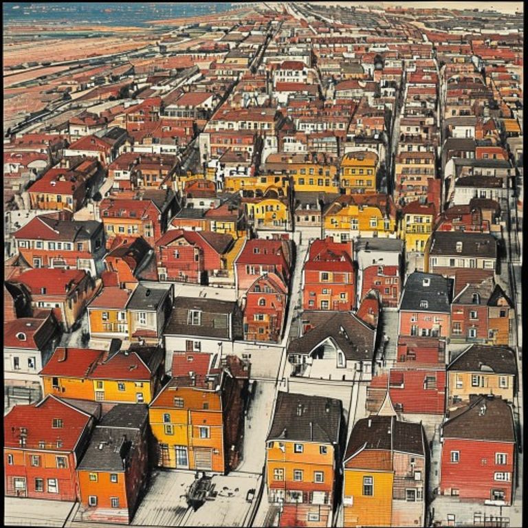
Re-render this urban location as a Sanborn Fire Insurance Map, the standardized block-by-block city plan produced in the early 20th century by the Sanborn Map Company for fire-insurance risk assessment across American cities. Rendered in red, yellow, and black inks on off-white printed stock at large scale (typically 1:600 or 1:800). Base layer: every city block outlined in bold black lines, every building footprint shown in precise orthogonal outline at ground-floor dimensions. Building materials indicated by color: red for brick or masonry buildings, yellow for wood-frame structures, black for iron or steel, blue for stone or granite. Building height indicated by numeric annotation or symbolic notation (no legible text, render as text-free marks). Roof detail: parapet lines, mansard or flat-roof notations rendered in fine line-work. Street names rendered as text-free labels or period-style cartographic notation. Utilities and hazards: fire hydrants shown as small marked symbols, fire alarm boxes marked, railroad tracks rendered as parallel lines with cross-ties, power lines indicated by dotted lines or fine notation. Alleyways and courtyards shown with open space notation, open-air markets or public spaces indicated with specific symbol sets. Lot divisions and property lines indicated by thin lines between buildings. Numbered lot designations rendered as text-free marks (no legible numbers). Printed color register marks and margin notes rendered as period authenticity detail. Paper stock: aged cream or light tan with slight foxing and fold creases from atlas use. Preserve the subject, pose, and composition of the source image exactly, change only the medium and rendering.
What it is doing
The Sanborn map is the city translated into risk. Every building is not a home or a workplace, it is a liability. Red brick is lower risk, yellow wood is higher risk, iron is the premium calculation. The footprint shows the insurance company exactly where fire will spread fastest, which buildings are sacrifice, which are worth defending. The map is not civic planning, it is the actuarial knowledge of which neighborhoods burn first. Every alleyway is a fire-spread vector. Every hydrant placement is a firefighter's time-calculation. The Sanborn map is the proof that American cities were not built for their inhabitants, they were built for the measurement of loss. The numbers on the buildings are not addresses, they are insurance premiums attached to coordinates.
Tuning knobs
- Urban-density dial: `sparse small-town blocks` vs `medium-density mixed-use city` vs `dense downtown commercial core with narrow alleys`
- Era-characteristic dial: `early 1900s typical coloring and notation` vs `mid-century standardized notation` vs `late period detailed fire-escape annotation`
- Building-material color emphasis: `bold saturated red and yellow distinction` vs `lighter pastel tones` vs `heavy black outline dominance with color fill secondary`
- Utility-notation complexity: `minimal hydrants and hazards marked` vs `comprehensive utility network` (fire hydrants, alarm boxes, power lines) vs `specialized industrial notation` (rail spurs, water connections, manufacturing hazards)
- Text-annotation style: `minimal text-free marks` vs `period-style cartographic shorthand` vs `preserved period abbreviations and symbols`
- Paper-aging dial: `crisp printed impression` vs `moderate foxing and age toning` vs `heavy fold creases and water staining from repeated field reference`
Style lineage
Learn the visual culture this draws from: UC Berkeley.
Related prompts
See all 7 prompts in the Cartography-Operational-Map grammar · Open in the gallery