Antique Copperplate Cartouche
The 16th-17th century copperplate-engraved map, the medium that turned territory into sovereign claim. Hachure shading, ornate cartouche, compass rose rendered as architectural frame.
The prompt
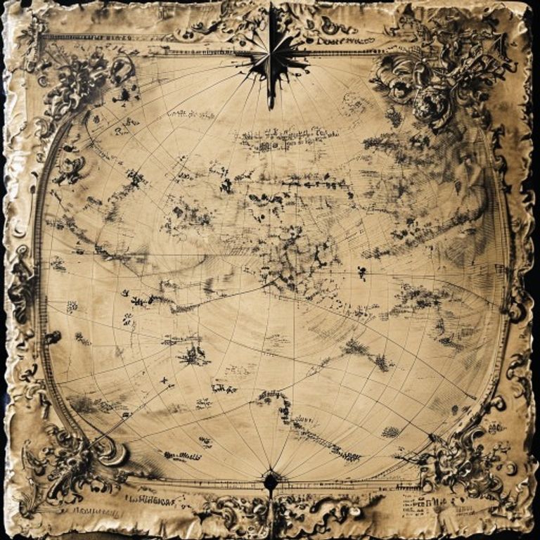
Re-render this location as an antique copperplate-engraved map in the style of 16th-17th century European cartography, with fine line-work produced by engraved copper plate printing. The map itself rendered in black line-work on cream or off-white paper stock: fine linear hatching (hachures) to indicate elevation and terrain relief, giving the appearance of hand-drawn shading. Geographic lines (coastlines, rivers, boundary lines) rendered with precise engraved fineness, some heavier than others to indicate importance. Decorative cartouche in lower left or right margin: an ornate architectural frame containing the place-name and legend in period script, surrounded by baroque scrollwork, allegorical figures (Navigation, Geography, or Minerva), and natural elements (ships, anchors, sea creatures, celestial bodies). Compass rose placed prominently: rendered as a geometric star with radiating lines, cardinal directions marked with period typography. Scale bar shown as a segmented line with numerals. Title cartouche rendered as text-free ornamental blocks (no legible lettering). Paper surface aged: slight foxing (brown discoloration), linear fold creases visible where the sheet was once folded. Marginal notation rendered as text-free marks and symbolic conventions typical of period surveying (latitude/longitude graticule, depth soundings). Color palette: warm cream-white stock with black ink, slight ochre aging. Preserve the subject, pose, and composition of the source image exactly, change only the medium and rendering.
What it is doing
The copperplate map is not an image of territory. It is a legal claim scratched into copper, bitten by acid, then inked and pressed onto paper and distributed among sovereigns. The hachures are not terrain, they are the engraver's statement that this land belongs to somebody. The cartouche is not ornament, it is the frame that says "this is official, this is witnessed, this is recorded." The compass rose is not navigation, it is an assertion that the viewer stands at the center of the world. The map arrived after the territory was already claimed, discovered, or stolen. The engraver's job was not to describe what the land looked like but to prove who owned it. Every fold in the paper is a journey the claim took across borders. The aged foxing is not damage, it is authentication.
Tuning knobs
- Engraving-era dial: `early Dutch Golden Age` (1580s fine line-work) vs `Baroque ornate` (1650s scrollwork-heavy) vs `late 17th-century refined` (precise graticule, austere cartouche)
- Terrain-rendering dial: `dense hachure shading throughout` (steep relief indicated) vs `minimal hachuring, open field` (flat lowland) vs `stipple-dot shading for wetlands`
- Cartouche-style dial: `architectural frame with seated allegories` vs `scrollwork and sea creatures` vs `heraldic shield with banner`
- Compass-rose complexity: `simple cardinal star` vs `elaborate 16-point radiating wind-rose` vs `ornate ship and astrolabe integration`
- Aging and damage dial: `crisp fresh impression` vs `moderate foxing, central fold visible` vs `heavy age patina, surface creases`
- Paper-stock dial: `cream laid paper texture` vs `aged vellum appearance` vs `slightly yellowed rag-paper`
Style lineage
Learn the visual culture this draws from: Library of Congress.
Related prompts
See all 7 prompts in the Cartography-Operational-Map grammar · Open in the gallery