Albers Homage to the Square Color Interaction (Style-Only, Image-Conditioned)
Style register: Josef Albers Homage to the Square 1950s to 1970s, nested concentric rectangles, flat unmodulated planes painted with palette knife directly on Masonite, color treated as a relational fact rather than a descriptive one.
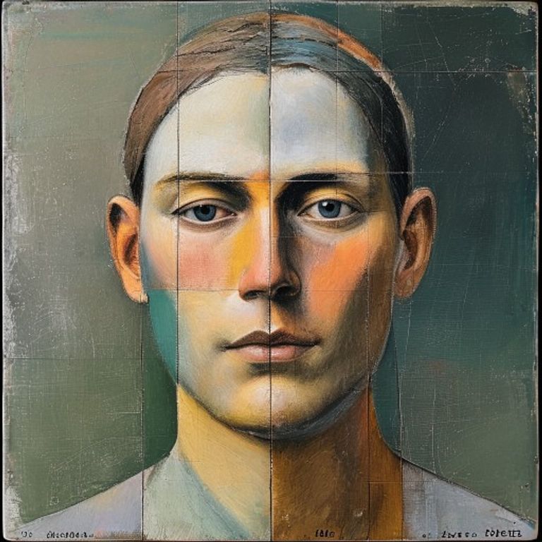
The prompt
Re-render this image in the visual register of a Josef Albers Homage to the Square painting, circa 1955 to 1972. Treat the picture surface as four nested rectangular fields of flat color, each one progressively smaller and offset toward the lower half of the canvas, the underlying subject reading through the field structure as if seen through stacked colored glass. Each field is one absolutely flat unmodulated tone, applied with palette knife straight from the tube, no brushwork, no gradient, no shading, the field is the color and nothing else. Build palettes around adjacent-pair interactions that destabilize each other (ochre next to grey-green, vermilion next to dusty pink, ultramarine next to warm lavender) so the eye reads the boundary as vibrating rather than flat. Masonite ground texture barely visible at the edges where the palette knife thinned. No outlines, no separating lines between fields, only the color edge doing the work. Caption-back era handwritten notation absent from the painted face. Mood: meditative, didactic, the painting as proof that perception is relational and that no color exists alone. Strictly no on-canvas text, no legible lettering, no signature, no watermark, no logos. Preserve the subject, pose, and composition of the source image exactly, change only the medium and rendering. Aspect ratio matches source.
What it is doing
Albers spent twenty-five years painting the same nested-square format because he was trying to prove a single thing with the patience of a Talmudic scholar: no color has a fixed identity, every color is what its neighbor lets it be. The political implication, almost never said out loud in the museum wall text, is that the same goes for people, identities, ideologies, anything you thought was essential. Albers is the closest the Bauhaus came to philosophy disguised as a color exercise.
Tuning knobs
- Field count: `4 nested` (signature) vs `3 nested (more open)` vs `5 nested (denser)`
- Offset direction: `weighted lower half` (signature) vs `centered` vs `weighted upper`
- Palette temperature: `warm-on-warm with one cool intruder` vs `cool-dominant` vs `pure complementary clash`
- Edge vibration: `adjacent-pair destabilizing` (signature) vs `harmonious safe pairs` vs `maximum contrast`
- Surface: `flat Masonite knife` (signature) vs `slight brush texture` vs `digital flat`
Style lineage
Learn the visual culture this draws from: Smarthistory.
Related prompts
See all 8 prompts in the Bauhaus grammar · Open in the gallery