Bayer Universal Typography Field (Style-Only, Image-Conditioned)
Style register: Herbert Bayer Dessau Bauhaus 1925 to 1928 universal-alphabet and poster grammar, geometric sans-serif logic, primary-color planes, exposed printer's grid, lowercase only as anti-hierarchical doctrine. Visual field only, no readable text.
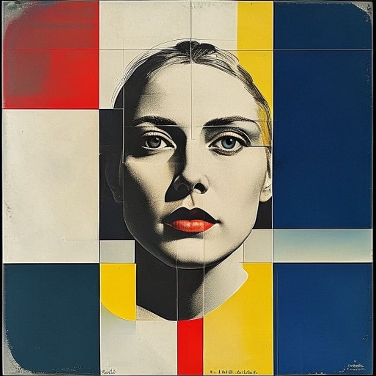
The prompt
Re-render this image in the visual register of a Herbert Bayer Bauhaus Dessau poster from 1925 to 1928, with one critical constraint: render only the visual field, never any readable letterforms. Treat the picture surface as a graphic-design composition built on an exposed orthogonal grid: heavy horizontal and vertical color bars in cadmium red, chrome yellow, cobalt blue, and stark black, laid against unbleached newsprint cream or pure paper white. Allow circular and rectangular planes to overlap at right angles, never on diagonals. The underlying subject sits inside the grid as if it were a photographic plate inset into a Bauhaus poster, the bars framing and dividing it without obscuring its core. Suggest typographic presence through geometric shapes that read as letter-adjacent (circles, half-circles, rectangles) but resolve into pure form rather than legible characters. Flat unmodulated color, no gradients, no airbrush, no shadow, hard mechanical edges as if printed by offset lithography on rough stock with slight misregistration showing a 1mm color halo at one or two seams. Mood: didactic, optimistic, the design as instruction manual for a rationalized public sphere. Strictly no on-canvas text, no legible lettering, no signature, no watermark, no logos. Preserve the subject, pose, and composition of the source image exactly, change only the medium and rendering. Aspect ratio matches source.
What it is doing
Bayer's universal alphabet (lowercase only, geometric, no historical flourish) was sold as a typographic experiment. The actual claim was political: capital letters are a hierarchical inheritance, a way of marking proper nouns, kings, gods, and institutions as more important than common ones. Removing the uppercase was an attempt to flatten the visual class system. The Bauhaus did not last long enough for this to fully play out, and the irony of "universal" rationalism collapsing under actual authoritarianism (the school closed 1933) hangs over every clean grid composition since.
Tuning knobs
- Bar weight: `heavy 8 to 12 percent of canvas width` (signature) vs `medium` vs `delicate hairline`
- Color set: `red yellow blue black on cream` (signature) vs `red and black only` vs `full four-color CMYK process`
- Grid strictness: `pure orthogonal no diagonals` (signature) vs `one allowed diagonal accent` vs `Elementarist tilt`
- Misregistration: `1mm color halo at seams` (signature) vs `perfect registration clean` vs `heavy 3mm punk-zine drift`
- Paper: `unbleached newsprint cream` (signature) vs `pure white` vs `aged manila`
Style lineage
Learn the visual culture this draws from: Britannica.
Related prompts
See all 8 prompts in the Bauhaus grammar · Open in the gallery