4AD Vaughan Oliver Ethereal (Style-Only, Image-Conditioned)
Style register: 4AD Records 1984 through 1995 grammar designed by Vaughan Oliver and 23 Envelope, found-object photography, layered transparencies, illegible custom typography, the cover refusing to explain itself, ethereal as house style.
The prompt
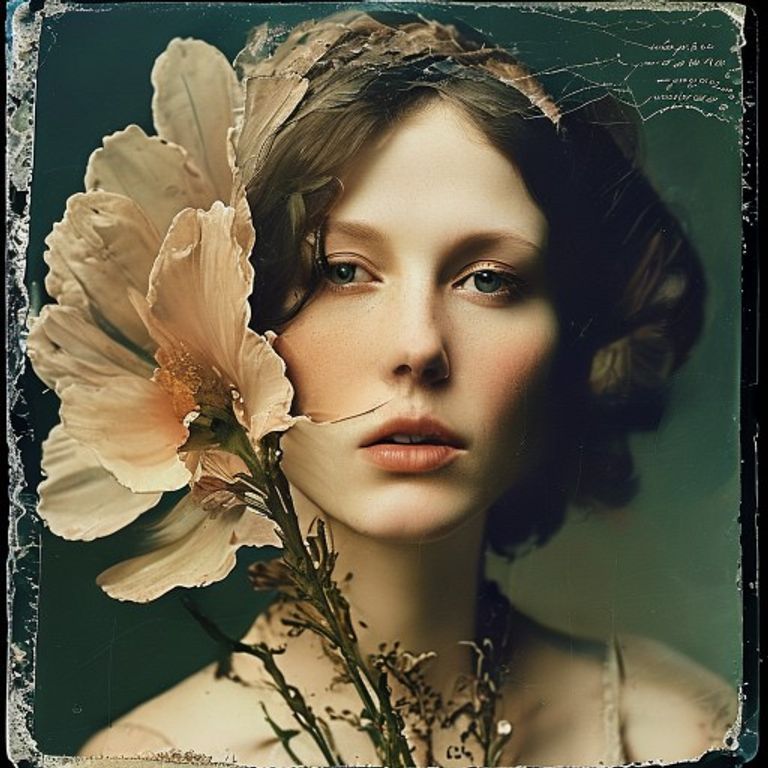
Re-render this image as a 4AD Records LP cover from the Vaughan Oliver / 23 Envelope design era, between 1984 and 1995, in the visual register of Cocteau Twins Treasure, Pixies Surfer Rosa, This Mortal Coil Filigree and Shadow, and Lush Spooky. Source treated as a multiply-layered photograph: medium-format film image of an organic or found object (a wilted flower, a piece of weathered metal, a piece of antique lace, a fragment of a Renaissance painting reproduced from a book) overlaid with semi-transparent secondary imagery, the two images held in soft tension. Color: desaturated, slightly browned, slightly cyan-shifted, the look of a photograph processed in too-warm chemistry, autumn palette of bone, brown, sage, faded rose, dusty turquoise, never primary. Edges of the photograph deliberately soft, vignetted, partially blurred at one corner, the picture refusing to commit to a clean rectangle. Typographic compositional space: a passage of CUSTOM ILLEGIBLE LETTERFORMS (refuse to render any actual readable text, just suggest the SHAPE of dense small condensed serif type, possibly hand-rendered, possibly upside-down, possibly partially obscured by the imagery, the typography ACTIVELY refusing to be read). Texture: slight rag-paper grain, soft photographic emulsion, the surface of an art-book reproduction rather than a slick commercial print. Square 12-inch LP-jacket aspect ratio. Atmosphere: dreamlike, hermetic, the cover belongs to a coterie that does not need to explain itself to the casual record-store browser. No legible text, no band name, no song titles, no label logos, no studio marks. Preserve the subject, pose, and composition of the source image exactly, change only the medium and rendering.
What it is doing
Vaughan Oliver designed 4AD covers for a record label whose biggest band sang in invented syllables. The covers MATCH that gesture: typography you cannot read, photography you cannot quite parse, color you cannot quite name. The 4AD register is a defiantly hermetic aesthetics, the refusal to be legible to the mass-market browser, the assertion that obscurity is a feature.
Tuning knobs
- Layering density: `two photographs in soft tension` (signature) vs `single image with overlay typography only` vs `triple layered`
- Subject vocabulary: `wilted flower / weathered metal / antique lace / Renaissance fragment` (signature) vs `body fragment` vs `industrial debris`
- Color register: `bone + sage + faded rose + dusty turquoise` (signature) vs `sepia + cyan only` vs `near-monochrome brown`
- Typography illegibility: `dense small condensed serif, partially obscured` (signature) vs `large illegible display` vs `no type space, pure image`
- Edge treatment: `vignetted, soft at one corner` (signature) vs `crisp rectangle` vs `torn-paper edge`
- Era: `mid-80s Cocteau` vs `late-80s Pixies / Throwing Muses` vs `early-90s Lush / Pale Saints`
Style lineage
Learn the visual culture this draws from: Time Out.
Related prompts
See all 28 prompts in the Album-Cover grammar · Open in the gallery
Get the free sample. The intro plus the first three chapters of The Liberation Engine, delivered as a PDF. The full book and the complete 557-prompt method are the paid edition.