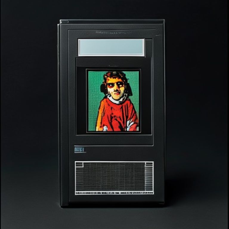
NES 1985 Black-Box Launch-Title Grid Frame
The original Nintendo Entertainment System black-box launch register. Pictogram, single illustration tile, austere grid, no marketing prose. The package as restraint.
The prompt
Re-render this image as a 1985 Nintendo Entertainment System launch-title black-box video game package, the original 30-title American launch register designed before marketing departments learned to over-promise. Box format: vertical rectangular package, slightly taller than wide, matte black background covering the full surface. Upper third of the package: simple pictogram-style icon inside a thin white-bordered square (the genre-tile, hand-drawn glyph indicating the subject in the most reductive possible terms, single color line). Middle of the package: a single rectangular illustration window with a thin white border, illustration inside rendered as a small flat-color painting, limited palette (four to six colors max), no airbrush gradients, no photo-realism, the illustration treated as a postage stamp of the subject rather than a hero shot. Lower portion: thin horizontal white line dividing illustration from a clean strip below where the title would sit (suggest as a darker rectangle, no legible lettering). Overall composition: extreme austerity, generous black negative space, grid-based layout, every element aligned to invisible rules, the package treating the buyer as an adult who can read a pictogram and decide. No on-canvas text, no logos, no legible brand marks anywhere. Print quality: 1985 offset litho on coated boxboard, slight halftone dot pattern visible on close inspection, ink lightly raised, registration tight but not perfect. Mood: the package as restraint, the package as promise-of-substance rather than spectacle, the launch-title register before the medium learned to lie about itself. Preserve the subject, pose, and composition of the source image exactly, change only the medium and rendering. Aspect ratio is standard NES box vertical portrait (roughly 5:7).
What it is doing
The 1985 NES black-box launch line is the most austere mass-market consumer-software packaging in American history. It treats the buyer as competent. The pictogram + single illustration tile + black ground says: this is the thing, decide. Compare to the 2026 digital storefront tile, which screams, animates, and overlays five badges. The black box is the sovereign object before the marketing department got hold of the medium.
Tuning knobs
- Pictogram dial: `single hand-drawn glyph` (canonical) vs `pictogram strip of three` (later black-box variant) vs `omitted` (silver-box transition)
- Illustration palette: `four-color flat` (austere) vs `six-color flat with one accent` (mid-1985) vs `eight-color with shading` (late black-box drift)
- Border treatment: `thin white hairline` (canonical) vs `double-rule white` (rare variant) vs `no border, illustration floats on black` (deluxe-rare)
- Print-wear dial: `mint shrink-wrapped` (collector) vs `light shelf wear` (lived-in) vs `corner-crush + sticker residue` (rental-store relic)
- Halftone dial: `tight 1985 registration` (canonical) vs `loose registration with slight color drift` (off-print) vs `clean digital-flat` (modern reissue)
Style lineage
Learn the visual culture this draws from: WATA Games.
Related prompts
See all 26 prompts in the Video-Game-Case grammar · Open in the gallery
Get the free sample. The intro plus the first three chapters of The Liberation Engine, delivered as a PDF. The full book and the complete 557-prompt method are the paid edition.