Grain Touch Dither Stencil (Style-Only, Image-Conditioned)
Style register: irregular grain-touch image preparation, sparse scattered ink islands in the lights and clustered pigment in the shadows.
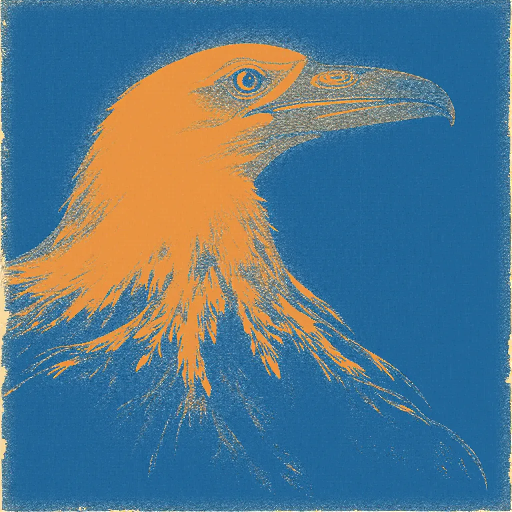
The prompt
Re-render this image as a risograph grain-touch stencil, following late twentieth-century analog image-processing experiments with layered grids and overprints and the techniques of stencil duplication. Before printing, break the source's smooth tones into irregular islands of pigment rather than ordered halftone circles. Dark values gather into clusters of small rough flecks; midtones disperse into a fine stippled cloud; highlights survive as open uncoated paper. Print the prepared master in saturated ocean blue, then lay a second pale apricot stencil only across selected broad planes. Allow isolated apricot grains to glimmer through blue where the two masters overlap, producing a subtly warmer shadow without muddying the subject. The grain should be tactile and clearly visible in large shapes, not a blanket of digital static covering everything. Retain crisp outer contours for instant recognition and reserve this broken texture for interior shading. Paper feed drift can slightly separate the second pass from the first, especially at the edge of a broad shadow. Show the stencil duplicator's soft ink edges, a few plugged specks, and warm uncoated paper absorbing the thinnest blue marks. The result feels handmade but disciplined, a tonal image whose surface can be read as individual decisions. Leave a calm, uncluttered band of negative space along the top or bottom edge where a title could sit. Strictly no on-canvas text, no legible lettering, no signature, no watermark, no logos. Preserve the subject, pose, and composition of the source image exactly, change only the medium and rendering. Aspect ratio matches source.
What it is doing
Grain-touch preparation makes the smallest printed units visibly contingent. Unlike a stable dot screen, clusters and gaps create tonal information through apparent randomness. The eye supplies continuity while the sheet shows every interruption.
Tuning knobs
- Grain scale: `visible small ink islands` (signature) vs `very fine stipple` vs `large scattered flecks`
- Shadow grouping: `clustered blue marks` (signature) vs `open even dispersion` vs `near-solid blue`
- Apricot pass: `selected broad planes` (signature) vs `thin rim accents` vs `apricot omitted`
- Contour: `crisp outer silhouette` (signature) vs `soft grain edges` vs `mostly flat border`
- Paper warmth: `warm absorbent white` (signature) vs `cold white stock` vs `light sand stock`
Related prompts
See all 10 prompts in the Risograph grammar · Open in the gallery
Get the free sample. The intro plus the first three chapters of The Liberation Engine, delivered as a PDF. The full book and the complete 642-prompt method are the paid edition.