Fountain Fade Ink Gradient (Style-Only, Image-Conditioned)
Style register: a long tonal fade simulated by screened stencil coverage, from concentrated ink to nearly bare stock within a single printed field.
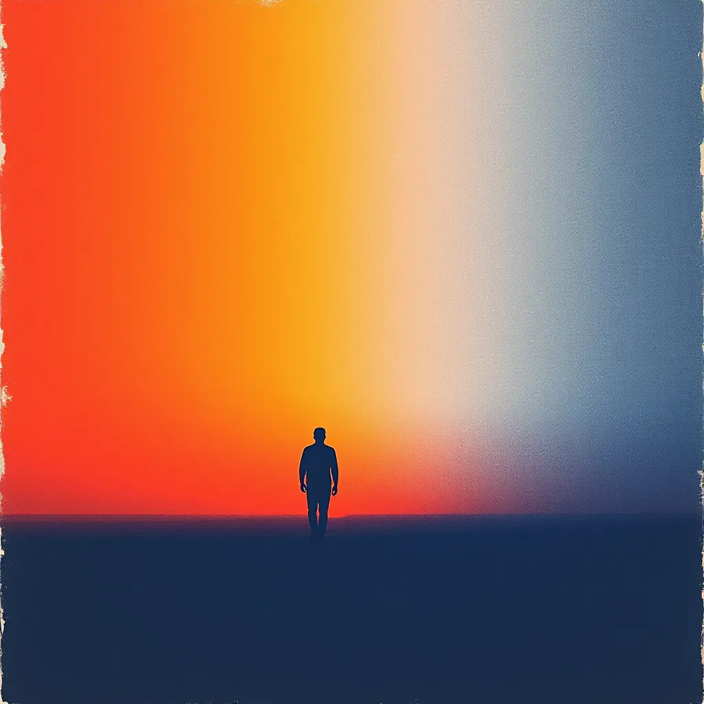
The prompt
Re-render this image as a risograph print organized around a slow ink fade, drawing on the quiet color-field sensibility of Luis Barragan and contemporary independent stencil-print studios. Keep the source forms intact, but map their broadest illuminated plane into a long vertical passage from saturated vermilion at one end to pale, almost unprinted paper at the other. Achieve the fade through progressively sparser stencil coverage and changing dot size, not a flawlessly smooth digital blend. A second midnight-blue drum prints the subject's essential contours and a few broad shadow shapes; let its thin areas reveal faint grain and the warm paper beneath. The vermilion pass has slightly inconsistent ink pressure across its width, making a subtle irregular horizon where one density yields to another. Avoid random bands, rainbow colors, or a painted watercolor wash. The full design uses one warm ink, one cool ink, and the sheet itself. Preserve bold silhouettes and a clearly staged center of visual weight so the image remains readable at small scale. Allow the blue to cross the fading field, producing a few dark violet overprint accents near the focus. Mood: spacious, warm, and deliberately unfinished at the lightest edge. Leave a calm, uncluttered band of negative space along the top or bottom edge where a title could sit. Strictly no on-canvas text, no legible lettering, no signature, no watermark, no logos. Preserve the subject, pose, and composition of the source image exactly, change only the medium and rendering. Aspect ratio matches source.
What it is doing
A gradient can be made from omission. Here the lighter end is not a lighter pigment: it is less stencil coverage and more sheet. Tonal transition becomes a record of how much ink the surface could hold.
Tuning knobs
- Fade direction: `vertical passage` (signature) vs `horizontal passage` vs `diagonal passage`
- Low end: `nearly bare stock` (signature) vs `pale vermilion veil` vs `abrupt blank edge`
- Screen transition: `progressively sparser coverage` (signature) vs `stepped bands` vs `large variable dots`
- Blue pass: `essential contours and shadows` (signature) vs `outlines only` vs `few dense shadow blocks`
- Overlap: `selective violet focus` (signature) vs `no overlap` vs `broad violet plane`
Related prompts
See all 10 prompts in the Risograph grammar · Open in the gallery
Get the free sample. The intro plus the first three chapters of The Liberation Engine, delivered as a PDF. The full book and the complete 642-prompt method are the paid edition.