Swiss International Typographic Helvetica Grid
The Müller-Brockmann, Hofmann, Lohse Zürich-Basel grid register, the visual claim of rationalist neutrality that has done political work for everything from NATO to United Airlines to the Federal Government.
The prompt
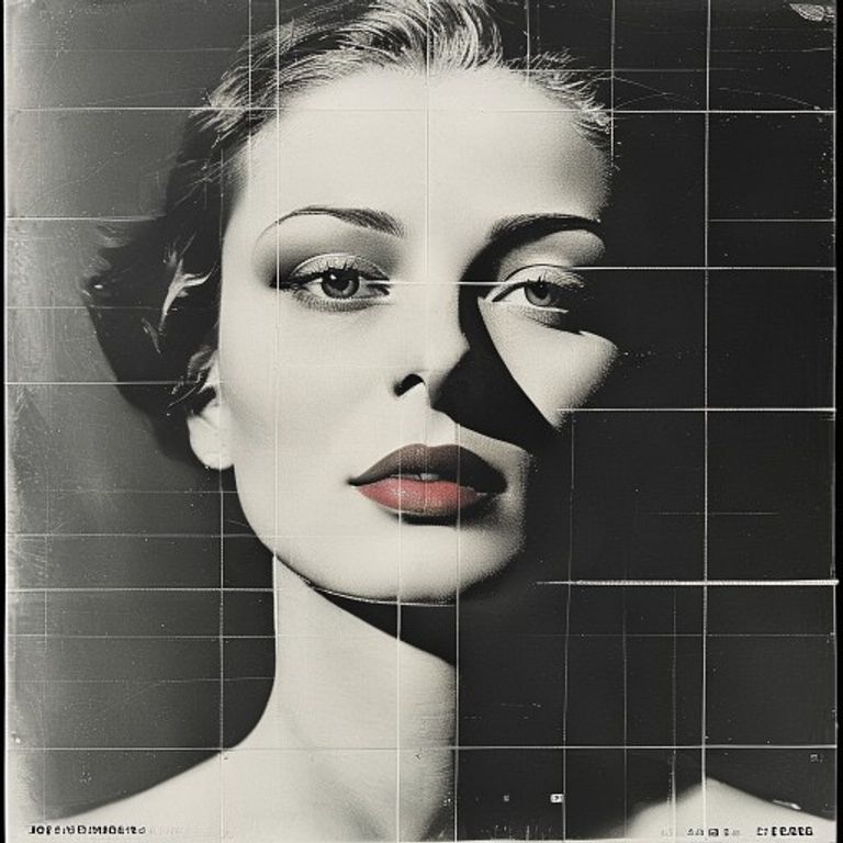
Restyle the source image as a 1957 to 1975 Swiss International Typographic Style poster or institutional publication aesthetic, in the visual register of Josef Müller-Brockmann (Zürich Tonhalle posters), Armin Hofmann (Basel School), Karl Gerstner, Richard Paul Lohse, and the Neue Grafik movement. Render as a precise offset-lithograph on heavy white coated stock with the discipline of the modular grid system. Palette severely restricted: pure white paper ground, dense process black, plus exactly one accent (cadmium red OR pure cyan OR cadmium yellow OR cool grey). No additional colors. Compositional structure is governed by a visible 12-column or 8-module grid: every element aligns to the grid, every photograph cropped to grid coordinates, every blank space measured. Photographic elements (if any) are silhouetted high-contrast black-and-white halftones cropped severely to geometric rectangles. Typography zones occupy specific grid cells, typically asymmetric: a tall left column, a short headline band, a baseline footer. Render all type zones EMPTY: no letterforms, no Helvetica, no Akzidenz-Grotesk, no kerned text, no script, no logos, no institutional marks, no event titles, no dates. Mood is precise, rational, calm, ostentatiously neutral. Forbid all explicit national, state, or party symbols of any kind: no Swiss cross, no NATO compass, no UN olive branches, no federal seals, no corporate logos, no flags. Preserve the exact subjects, faces, poses, gestures, and spatial arrangement of the source image without alteration; restyle the rendering only.
What it is doing
The Swiss International Style was branded as the end of style, the achievement of pure neutral functional design. This was itself a political claim. By presenting itself as objectively rational, the grid laundered the institutions that adopted it: corporations, federal agencies, NATO, IBM, Lufthansa, the IRS. "Neutrality" became the most ideologically loaded aesthetic of the second half of the 20th century. Müller-Brockmann's posters for the Zürich Tonhalle were genuinely beautiful art; the same visual language used for institutional power claims a transparency it does not have. The grid does not eliminate ideology, it conceals it.
Tuning knobs
- Era beat: `1957-Müller-Brockmann-early` vs `1965-Hofmann-Basel-peak` vs `1972-Gerstner-late-international`
- Accent color: `cadmium-red` vs `pure-cyan` vs `cadmium-yellow` vs `cool-grey-only`
- Grid density: `8-column-loose` vs `12-column-dense` vs `modular-12x12-strict`
- Photographic register: `silhouette-cutout` vs `severely-cropped-halftone` vs `pure-typographic-no-image`
- Mood: `austere-institutional` vs `cultural-program-elegant` vs `corporate-annual-report`
Related prompts
See all 32 prompts in the Propaganda grammar · Open in the gallery