Vintage-Ad / Style prompt
1960s Volkswagen Bernbach Minimal Irony
Helmut Krone and Bill Bernbach's white-space, anti-advertising register that weaponized self-deprecation into the highest-status claim of the decade.
Customize this prompt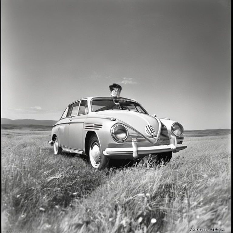
The prompt
Restyle the source image as a 1960s Doyle Dane Bernbach magazine advertisement in the Helmut Krone art-direction tradition for Volkswagen, ca. 1959 to 1965. Render as a single product or subject photograph, isolated, floating in a vast field of pure white magazine paper. The subject occupies the upper two-thirds of the canvas, centered or slightly left, photographed in flat even daylight with no studio drama, no soft-box glamour, no retouching of imperfection. Black and white photographic register OR muted natural color, never saturated. Below the subject leave the lower one-third as completely empty white space, the negative-space zone where Bernbach's three-line headline and body copy would sit. Render this zone empty: no letterforms, no kerned type, no signature, no script. The composition's entire persuasive force comes from what is NOT there: no swooshes, no gradients, no decorative borders, no aspirational background, no model smiling at camera. Paper texture is uncoated magazine stock with the faintest warmth. Preserve the exact subject, pose, angle, and spatial arrangement of the source image without alteration; restyle the rendering only.
What it is doing
Bernbach's revolution was that admitting your product was small, ugly, or imperfect was the highest-status claim available in a sea of aspirational lies. White space said "we don't need to shout." Self-deprecation was the new aristocracy of taste, available only to brands secure enough to mock themselves. The technique was anti-advertising as the apex of advertising.
Ways to change it
Pick any of these in the gallery and the choice is added to the prompt you copy.
- Photo register: pure-black-and-white vs muted-natural-color vs single-product-color-only
- Subject scale: tiny-lonely-object vs medium-isolated vs cropped-detail
- Headline-zone shape: lower-third-blank vs centered-bottom vs right-justified
- Background: studio-white-seamless vs bare-floor-shadow vs outdoor-empty-asphalt
- Visual tone: subject centered in upper two-thirds, frank and plain (signature) vs subject tiny in the upper left, dwarfed by vast white paper vs close, blunt crop showing one small visible flaw or dent vs subject slightly off-kilter, deadpan, like an awkward candid snapshot
Style lineage
Learn the visual culture this draws from: Britannica.
Related prompts
See all 23 prompts in the Vintage-Ad grammar
Read the full free book. All thirty-six chapters and the companion 657-prompt image library are free.