Four Panel Pop Color Block (Style-Only, Image-Conditioned)
Style register: 1960s Pop color-block experiments as one continuous image crossing four chromatic fields, not Warhol's grid of repeated pictures.
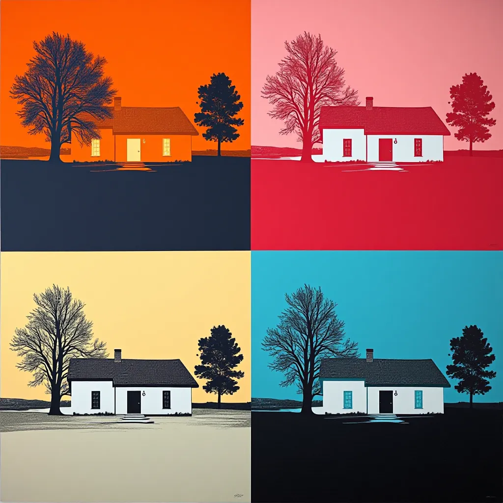
The prompt
Re-render this image as a single continuous 1960s Pop screenprint crossing four large color-block panels. Draw one vertical and one horizontal divide through the source, then hold the original scene, subject, and spatial relationships uninterrupted across those divides. Do not repeat the picture four times: each quadrant shows only its own portion of the same image. Give each panel a distinct flat paper and ink pairing: tangerine and navy, bubblegum pink and cherry red, pale butter and cobalt, mint and black. Change the color relationship abruptly at the cross-shaped seams while carrying every source outline across the borders with exact alignment. Screenprint the forms through bold cut-paper stencils with crisp edges and a little pooled pigment near the corners of each block. Let one screen overlap a seam by a slender sliver to reveal the physical order of printing, but never shift the subject's contours. Omit gradients and tiny decorative shapes; the transformation lies entirely in the four competing color climates. Keep enough open ground in one outer strip for visual rest. The mood is playful yet analytical, as if one unchanged observation has been tested under four contradictory lights. Reference large-format 1960s Pop color experiments. Leave a calm, uncluttered band of negative space along the top or bottom edge where a title could sit. Strictly no on-canvas text, no legible lettering, no signature, no watermark, no logos. Preserve the subject, pose, and composition of the source image exactly, change only the medium and rendering. Aspect ratio matches source.
What it is doing
Color changes an image's emotional temperature while the depicted event remains intact. A four-way division makes that argument in a single uninterrupted scene rather than using four mechanically repeated icons.
Tuning knobs
- Seam: `straight centered cross` (signature) vs `slightly off-center cross` vs `wide white gutters`
- Color contrast: `four opposed color climates` (signature) vs `two paired climates` vs `warm-to-cool progression`
- Stencil: `sharp cut-paper edge` (signature) vs `soft screen edge` vs `rough hand-painted edge`
- Ink overlap: `one slender seam overlap` (signature) vs `perfectly flush panels` vs `wide overlapping ink`
Related prompts
See all 10 prompts in the Pop-Art grammar · Open in the gallery
Get the free sample. The intro plus the first three chapters of The Liberation Engine, delivered as a PDF. The full book and the complete 642-prompt method are the paid edition.