One Bit Desktop Dither Study (Style-Only, Image-Conditioned)
Style register: early desktop paint-program monochrome graphics, one-bit black-and-white pixel marks and handmade halftone fields.
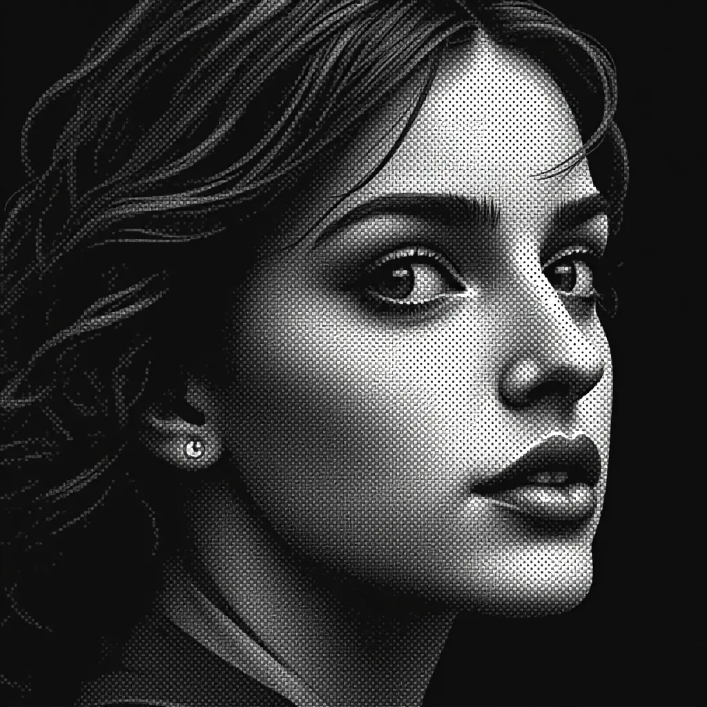
The prompt
Re-render this image as a one-bit monochrome bitmap drawn in an early desktop paint program, using only pure black and warm paper white. Build the subject's outline from square bitmap steps; describe intermediate tones through the density of black pixels, never gray. Use ordered dither textures: wide white gaps in bright passages, spaced black islands in midlights, checkerboard in middle values, and near-solid black in deep shadow. Shift patterns only where the source's light changes, so they describe volume rather than uniform static. Recall early desktop bitmap illustration, made one cell at a time with a selection tool, pencil tool, and pattern fill. Render curved contours as honest stair steps, keeping the image recognizable from a few steps away. Avoid screen borders, menus, cursors, printed type, variable-size pixels, antialiasing, grays, and simulated torn paper. Retain broad blank regions of white and at least one mass of uninterrupted black to anchor the composition. Give each texture a direction and a reason to occupy its part of the source. If the original is colorful, translate its color differences into a coherent hierarchy of light values. Leave a calm, uncluttered band of negative space along the top or bottom edge where a title could sit. Strictly no on-canvas text, no legible lettering, no signature, no watermark, no logos. Preserve the subject, pose, and composition of the source image exactly, change only the medium and rendering. Aspect ratio matches source.
What it is doing
When only black and white are available, texture is not decoration: it becomes a precise account of illumination and attention. The source's color must earn translation into value.
Tuning knobs
- Midtone pattern: `regular checkerboard` (signature) vs `diagonal weave` vs `widely spaced dots`
- Black mass: `one strong solid region` (signature) vs `several smaller anchors` vs `mostly open white`
- Grid density: `legible bitmap cells` (signature) vs `coarse visible squares` vs `finer compact cells`
- Paper white: `warm pale field` (signature) vs `cool bright white` vs `soft ivory`
Related prompts
See all 9 prompts in the Pixel-Art grammar · Open in the gallery
Get the free sample. The intro plus the first three chapters of The Liberation Engine, delivered as a PDF. The full book and the complete 606-prompt method are the paid edition.