Anuszkiewicz Color Vibration Field (Style-Only, Image-Conditioned)
Style register: Richard Anuszkiewicz 1964 to 1972 American Op-Art, color-vibration grids learned directly from Josef Albers at Yale, radial or rectilinear symmetry, saturated complementary pairs producing optical buzz at the edge.
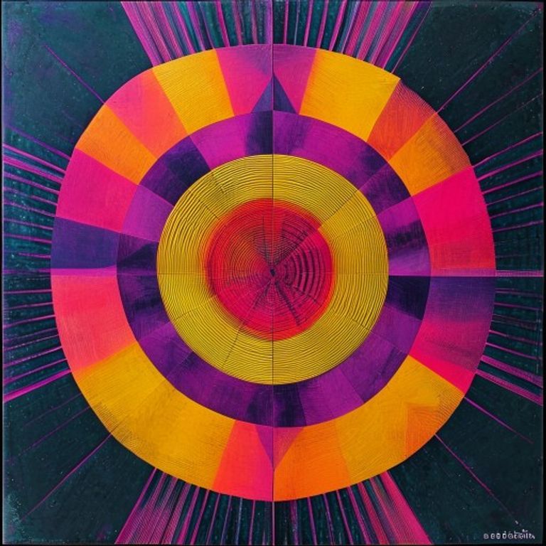
The prompt
Re-render this image in the visual register of a Richard Anuszkiewicz Op-Art painting, circa 1964 to 1972. Treat the picture surface as a symmetrical (radial or rectilinear) field of nested geometric forms (concentric squares, nested diamonds, radiating lines) each form filled with a single saturated color from an aggressive complementary palette: viridian against magenta, cadmium orange against deep ultramarine, lemon yellow against violet. Adjacent forms must always be high-chroma complementaries so that the boundary between them produces a visible optical buzz, the eye unable to settle on the edge. The underlying subject is woven into the symmetry as the central nested zone or radial origin point. Color application is absolutely flat, unmodulated, acrylic on hardboard, no brushwork, no gradient, no anti-aliasing at edges. Composition feels rigorously symmetrical, mathematically precise, almost mandala-like in its centered focus. Mood: hypnotic, retinal-bombarding, the Albers color-theory lesson taken to its loudest American extreme. Strictly no on-canvas text, no legible lettering, no signature, no watermark, no logos. Preserve the subject, pose, and composition of the source image exactly, change only the medium and rendering. Aspect ratio matches source.
What it is doing
Anuszkiewicz studied under Albers at Yale and absorbed the lesson that color is relational. Then he took the quiet meditative Albers Homage square and amplified it into a retinal assault. The American move was to take a European didactic exercise and turn the volume to eleven. There is a buried claim about American taste here: that subtle relational color is European and serious, that loud high-chroma vibration is American and democratic, that the former is for collectors and the latter is for the public who actually walked into the 1965 MoMA Responsive Eye show. He was correct, attendance was unprecedented. Op-Art was the first abstract movement the general public liked, and the snobbier critics never forgave it for that.
Tuning knobs
- Symmetry type: `radial nested forms` (signature) vs `rectilinear concentric` vs `bilateral mirror`
- Complementary intensity: `aggressive saturated buzz` (signature) vs `muted near-complementaries` vs `single complementary pair only`
- Form vocabulary: `nested squares and radiating lines` (signature) vs `pure concentric circles` vs `diamond lattice`
- Edge: `razor-precise flat acrylic` (signature) vs `slightly hand-painted` vs `screenprint halftone`
- Center weight: `subject at radial origin` (signature) vs `subject offset from center` vs `multiple centers`
Style lineage
Learn the visual culture this draws from: TheArtStory.
Related prompts
See all 6 prompts in the Op-Art grammar · Open in the gallery