Movie-Poster / Style prompt
Italian Fotobusta Painted Photoreal
The Italian lobby-card register (1950s through 1970s, photoreal oil and gouache poster painting). Painted likeness rendered with photographic conviction, dramatic stillness from inside the cinema.
Customize this prompt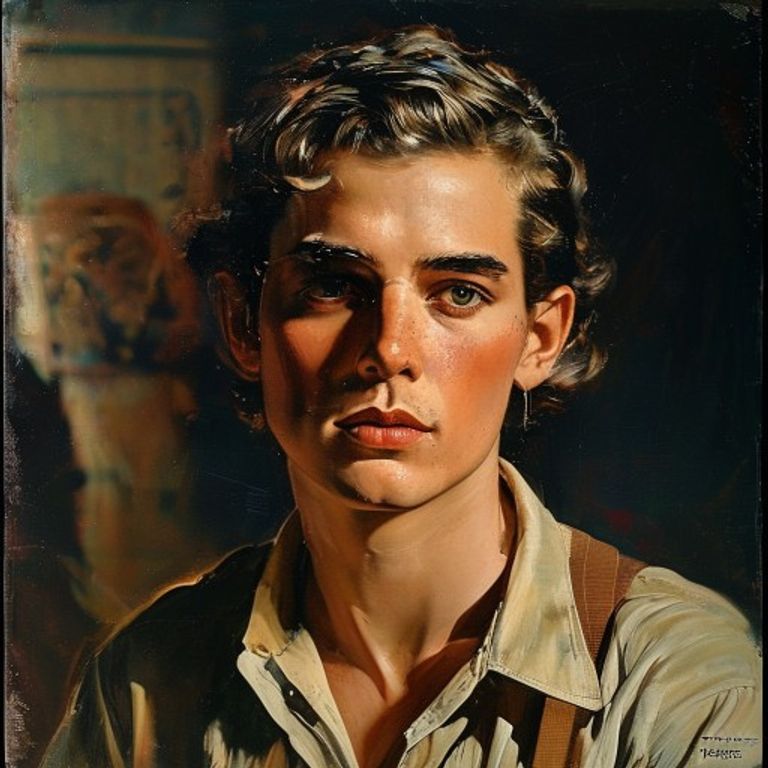
The prompt
Re-render this image in the visual register of Italian fotobusta cinema lobby cards (1950s through 1970s photoreal oil and gouache poster painting with warm theatrical portraiture). Painted in oils or gouache with photographic conviction, the brushwork tight enough to read as photoreal at viewing distance but loose enough to reveal its hand at close inspection. The Italian masters worked from on-set stills and rebuilt them as paintings, so the subject reads as a remembered photograph rather than a captured one. Palette warm and saturated Mediterranean: terracotta, ochre, deep umber, cobalt-sea, blood-vermilion, gilded highlights, with skin tones richer than reality. Lighting dramatic and theatrical: a single warm source carving the face, deep shadows held in the background, occasional rim light separating the figure from a painted soft-focus environment. Composition: subject occupying upper two-thirds of frame, often a tight three-quarter portrait, with secondary figures or environmental elements painted into a softer painterly background that reads as cinema-still memory. Surface: matte painted texture, visible brush in clothing and background, smoother passages on skin, no airbrush, no digital cleanness. Mood: heightened reality, the cinema as more real than the world outside, painted conviction substituting for photographic limit. Strictly no on-canvas text, no Italian title text, no taglines, no studio marks, no legible lettering, no signature, no watermark. Preserve the subject, pose, and composition of the source image exactly, change only the medium and rendering. Aspect ratio matches source.
What it is doing
The fotobusta painters worked from grainy 35mm publicity stills and produced images that felt more vivid than the films themselves. Skorzeny's principle of bold improvisation applies inverted: when the source material (a poor still) is weaker than the deliverable medium (oil paint at lobby-card scale), painting becomes an upgrade, not a translation. The lobby card outperformed the film. Audiences came back to the lobby to look at the paintings.
Ways to change it
Pick any of these in the gallery and the choice is added to the prompt you copy.
- Genre register: cool muted palette, single still portrait, calm gaze, sparse background vs wide dynamic action scene, dramatic motion, smaller figures against vast painted landscape vs tight tearful close-up, glowing warm skin, golden backlight, swooning romantic pose (signature)
- Era dial: 1955 postwar vs 1965 spaghetti western peak vs 1975 giallo late period
- Palette dial: terracotta-cobalt classical vs vermilion-gold western vs acid-green giallo
- Tightness dial: loose painterly vs medium realist vs tight photoreal near miniature
- Background dial: single soft-focus color field vs painted environment soft focus vs secondary figures rendered loose
Style lineage
Learn the visual culture this draws from: Limited Runs.
Related prompts
See all 34 prompts in the Movie-Poster grammar