Movie-Poster / Style prompt
70s Grindhouse Exploitation Airbrush Lurid
The 42nd Street, drive-in, exploitation register (1971-1979). Cheap, hot, fast, made to sell the ticket before anyone asked what the film was about.
Customize this prompt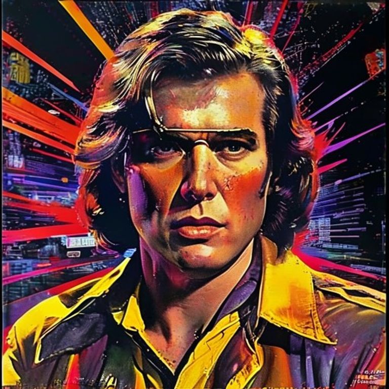
The prompt
Re-render this image in the visual register of 1970s American grindhouse and exploitation movie posters (42nd Street, drive-in, blaxploitation, kung fu, biker, slasher, roughly 1971 through 1979). Airbrush over photographic paste-up base: a heavily airbrushed painted overlay applied to a montage of high-contrast photo references, the seams between media visible and unhidden. Palette hot and clashing: blood-red, hazard-yellow, electric orange, deep purple-black, with metallic gold or silver accents and occasional shock-pink. Composition crammed: multiple scenes stacked, a dominant figure in the foreground three to four times scale of background figures, perspective deliberately broken for impact, asymmetric weight, lurching diagonals. Surface texture: cheap offset-print quality, dot-pattern halftone visible on the photo zones, painted zones overworked with airbrush highlights and hard outlines, occasional registration drift between color plates. Mood: lurid promise, violence and sex implied through composition and lighting rather than depicted, the poster doing the work of the trailer, every square inch selling. Strictly no on-canvas text, no title typography, no taglines, no legible lettering, no studio marks, no watermark. Preserve the subject, pose, and composition of the source image exactly, change only the medium and rendering. Aspect ratio matches source.
What it is doing
The grindhouse poster was an asymmetric weapon: tiny art budget, no stars, no festival pedigree, against major-studio competition with thousand-fold resources. Skorzeny would recognize the principle. Bold improvisation, shock value, sell the promise before the audience knows the product is hollow. The poster outperformed the film because the poster was the actual product.
Ways to change it
Pick any of these in the gallery and the choice is added to the prompt you copy.
- Subgenre dial: blaxploitation hot palette vs kung fu yellow-red vs slasher purple-black vs biker leather-and-chrome
- Crowding dial: single dominant figure vs three stacked scenes vs full-frame collage chaos
- Print quality dial: clean second-run vs cheap first-print misregistration vs worn faded one-sheet
- Palette dial: red-yellow-black vs purple-orange-pink vs metallic gold over dark
- Photo-to-paint ratio dial: mostly painted vs painted figure over photo background vs photo collage with painted highlights
Style lineage
Learn the visual culture this draws from: Grindhouse Cinema Database.
Related prompts
See all 34 prompts in the Movie-Poster grammar
Read the full free book. All thirty-six chapters and the companion 657-prompt image library are free.