Keith Haring Bold Line Pop Radiant
Early-1980s NYC subway-chalk and Pop Shop register: thick black-line bodies with radiant motion lines, primary-color flat fills, the visual grammar of friendliness laid over urgent politics.
The prompt
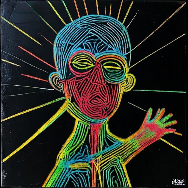
Re-render this image in the visual register of early to mid 1980s Keith Haring subway chalk work and Pop Shop merchandise paintings (the body of work produced on New York City subway advertising blackboards between 1980 and 1985, and the gallery and mural paintings through 1989 that extended that visual grammar). Bold uniform black outline aesthetic: every form bounded by an unvarying medium-weight black line, no line-weight modulation, no cross-hatching, no shading inside the outline. Palette restricted to playground primaries laid flat: cadmium red, cadmium yellow, ultramarine blue, leaf green, and optional hot pink and orange, with white or black backgrounds. Every figure or form emits radiant action lines: short straight black hash marks radiating outward from the figure indicating motion, energy, or vibration, the dance-line and the heartbeat-line as universal grammar. Surface options: matte black subway-advertising paper with white chalk only (monochrome variant), or stretched canvas with flat enamel, or exterior wall with flat acrylic. Rendering: confident continuous outline drawn in one motion without lifting, no preparatory sketch visible, all forms simplified to their iconic silhouette (no anatomical detail beyond the silhouette and the radiant lines). Light: flat, no shadow, no rendering of depth beyond simple overlap, every form lit equally by an abstract picture-plane light. Composition: figures often repeating, dancing, stacked, holding each other, the composition reading as a rhythm rather than a scene, frieze-like horizontal flow common. Mood: friendly, urgent, danceable, politically charged through repetition and gesture rather than through grimness, the visual grammar of joy carrying the message of crisis. Strictly no on-canvas text, no Haring signature, no Pop Shop mark, no AIDS-acronym lettering, no crack-is-wack lettering, no slogans, no watermark. Preserve the subject, pose, and composition of the source image exactly, change only the medium, line, and palette. Aspect ratio matches source.
What it is doing
Haring solved a problem Lansdale would recognize: how do you deliver a politically urgent message (AIDS, crack, apartheid, nuclear war) to an audience that turns away from grim political imagery? You wrap the urgency in a visual grammar that reads as friendly at first glance, dance-line bodies, radiant action lines, primary colors, and let the audience metabolize the gravity on a second pass. The bold black outline is the hearts-and-minds delivery mechanism, the politics arrive after the smile.
Tuning knobs
- Surface dial: `subway blackboard white chalk monochrome` vs `Pop Shop canvas full primary` vs `exterior wall mural` vs `vinyl tarp Pop Shop product`
- Radiance dial: `light radiant motion lines` vs `dense radiant force-field` vs `heartbeat-line repeating` vs `no radiance pure outline`
- Figure-density dial: `single figure isolated` vs `paired dancers` vs `crowd frieze repeating` vs `stacked pyramid composition`
- Palette dial: `pure primaries red-yellow-blue` vs `primaries plus hot pink and orange` vs `black and white only` vs `single accent over white`
- Era dial: `1981 subway-chalk emerging` vs `1984 Pop Shop opening peak` vs `1988 late mural work`
Style lineage
Learn the visual culture this draws from: Keith Haring (American artist, 1958-1990).
Related prompts
See all 15 prompts in the Graffiti-Mural grammar · Open in the gallery