Kandinsky Geometric Abstraction (Style-Only, Image-Conditioned)
Style register: Wassily Kandinsky 1920s-1940s, the subject rendered as a composition of geometric forms (circles, triangles, lines) in saturated color and black outline, the visible universe as a musical score made visible.
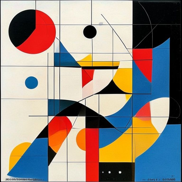
The prompt
Re-render this image as a Wassily Kandinsky geometric abstraction from the 1925 to 1935 period, in the visual register of "Composition" series and Bauhaus-era work. The entire canvas filled with a controlled composition of geometric forms: circles (perfect or slightly imperfect), triangles (equilateral and isosceles), rectangles, lines (some straight, some curved), arcs and segments. Forms arranged with mathematical intention but not rigidity, achieving a balance between order and spontaneity. Color restricted to primary colors (cadmium red, ultramarine blue, cadmium yellow), black, white, and occasional secondary colors (orange, green, purple) used as accents. Each form outlined in bold black sumi ink or geometric line, the black an essential compositional element separating forms and creating rhythm. Composition balanced across the vertical axis with occasional asymmetry for visual interest. Forms overlapping without optical mixing, all layers readable. Aspect: musical, spiritual, the visible translation of harmony and discord into geometric language. No curves that look organic, all curves calculated and architectural. No on-canvas text, no legible symbol, no signature. Preserve the subject, pose, and composition of the source image exactly, change only the medium and rendering.
What it is doing
Kandinsky believed form and color had spiritual properties: the triangle is aggressive, the circle is eternal, the straight line is pure will. He was not being poetic; he was being technical. Abstract art for Kandinsky was not the rejection of content but the replacement of narrative content with formal content, the way a musical score is pure content. The geometry is not cold; the geometry IS the feeling, rendered audible to the eye.
Tuning knobs
- Form vocabulary: `circles and triangles dominant` (signature) vs `heavily lined composition` vs `geometric shapes with curves`
- Color scheme: `primary colors plus black` (signature) vs `secondary and earth tones` vs `monochromatic single-hue`
- Black line role: `bold separating contour outline` (signature) vs `minimal linear accent` vs `no black outline`
- Composition balance: `asymmetrical dynamic` (signature) vs `symmetrical centered` vs `distributed floating`
- Form density: `medium-crowded, multiple layered forms` (signature) vs `sparse minimal shapes` vs `completely filled canvas`
- Curve quality: `controlled calculated arcs` (signature) vs `free gestural curves` vs `pure straight line geometry`
Style lineage
Learn the visual culture this draws from: Russian abstract pioneer (1866–1944).
Related prompts
See all 20 prompts in the Fine-Art grammar · Open in the gallery