Muller-Brockmann Swiss Grid Rationalism (Style-Only, Image-Conditioned)
Style register: Josef Muller-Brockmann 1955 to 1968 Zurich Swiss International Typographic Style, mathematical column grids, asymmetric balance, neutral sans-serif visual logic, ample white space treated as structural element.
The prompt
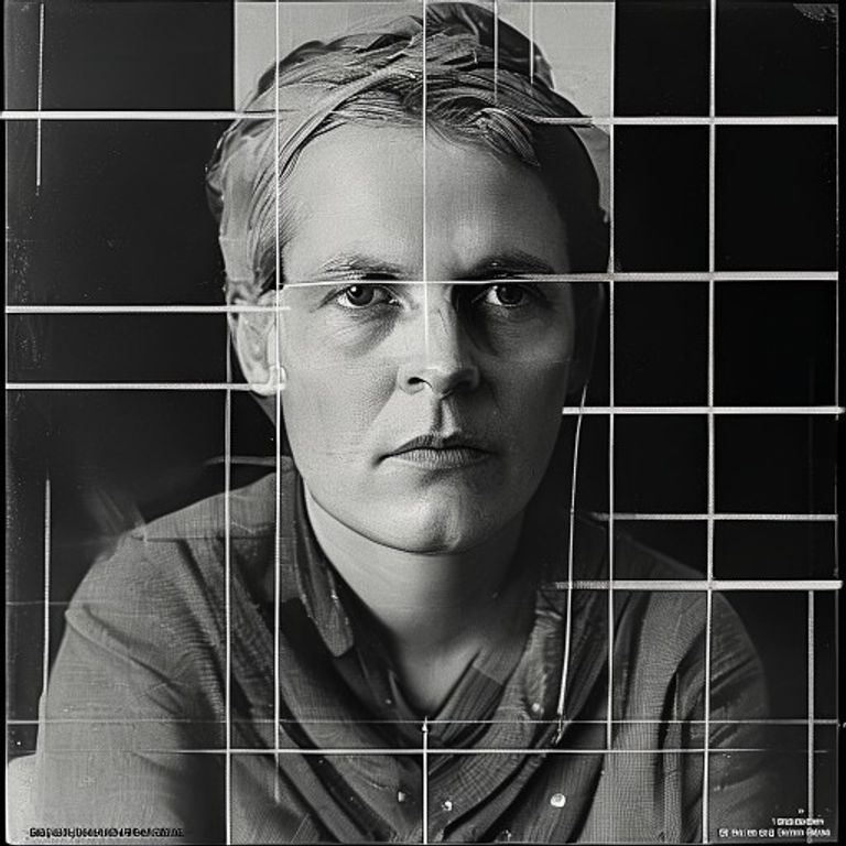
Re-render this image in the visual register of a Josef Muller-Brockmann Zurich poster from the high Swiss International Typographic Style, circa 1955 to 1968. Treat the picture surface as a mathematically constructed 12-column grid with generous white space (at least 30 percent of canvas left as pure unprinted ground). The subject sits inside the grid as a tightly cropped photographic element, locked to column edges, no centered framing, asymmetric balance achieved through deliberate counterweight of one large element against multiple smaller ones. Restrict color to one chromatic accent (Helvetica red, cobalt blue, or chrome yellow) plus pure black and the white of the page. Photographic subject rendered in high-contrast black and white duotone, deep shadows, clean highlights, no mid-tone mush. Implied typographic baselines run across the canvas as faintly visible structural ghost-lines (no actual letterforms). Edges and color blocks are mechanically perfect, offset-litho clean, no texture, no grain except the photographic subject itself. Mood: rational, severe, the discipline of the grid treated as a moral as well as visual practice. Strictly no on-canvas text, no legible lettering, no signature, no watermark, no logos. Preserve the subject, pose, and composition of the source image exactly, change only the medium and rendering. Aspect ratio matches source.
What it is doing
The Swiss grid was sold as objective and neutral. It was neither. It was a postwar Swiss moral claim that order, restraint, and mathematical proportion were the visual antidote to the fascist propaganda design that had just devoured Europe. Muller-Brockmann's grids are an ethical stance disguised as a typesetting method. To use this register today is to assert that visual restraint is a form of intellectual honesty, that the white space is doing more work than the content, and that any composition that fights the grid is cheating.
Tuning knobs
- Column count: `12-column mathematical` (signature) vs `6-column simpler` vs `golden-section asymmetric`
- White-space ratio: `30 percent minimum` (signature) vs `50 percent severe` vs `15 percent dense`
- Accent color: `Helvetica red` (signature) vs `cobalt blue` vs `chrome yellow` vs `pure greyscale`
- Asymmetry weight: `one large against many small` (signature) vs `balanced halves` vs `extreme corner-anchor`
- Photo treatment: `high-contrast duotone` (signature) vs `full continuous-tone` vs `flat poster-ization`
Style lineage
Learn the visual culture this draws from: Design Your Way.
Related prompts
See all 8 prompts in the Bauhaus grammar · Open in the gallery