1980s Brutalist Modular-Grid Typographic Sleeve (Typography-First Brutalist Register)
Style register: 1980s The Face magazine and Factory Benelux record sleeves, typography as primary image, modular grid structure, sans-serif as architecture, photographic source reduced to typographic servant.
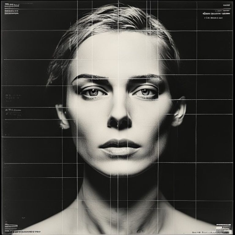
The prompt
Render the source image as an 1980s modular-grid typographic album sleeve, in the visual language of The Face magazine typographic covers and Factory Benelux modernist record design. Composition built on a rigid modular grid (preferably based on the Golden Section or a 3x3 grid dividing the cover into zones). Source photograph or image reduced to a SINGLE PHOTOGRAPHIC ELEMENT: either (a) a small-scale image fragment (thumbnail-sized, positioned in one grid zone only) treated as a footnote to the typography, (b) the source rendered as a silhouette or high-contrast bitmap used as a background texture behind typography, (c) the source image completely absent and replaced with pure geometric abstraction (solid color blocks, grid lines, negative space). Typography dominates. Artist name, album title, and label information rendered in bold brutalist sans-serif (Helvetica Bold, Univers Bold, or custom geometric sans-serif designed for maximum impact), each word or letter occupying its own grid zone, creating a rhythm across the cover where the TYPE ITSELF is the compositional subject. No attempt to make the type readable as flowing text, instead treat each letterform or word-block as an architectural element in a modular system. Monochromatic color scheme or restricted palette (black on white with one accent color: red, cyan, or yellow). Material: matte uncoated board with emphasis on the flatness of the paper itself, the type as pressure on the surface, no gloss or coating, pure tactile grid. Square 12-inch LP-jacket aspect ratio. Mood: authoritative, architectural, the cover as a manifesto not a picture, typography as infrastructure. No image-centered beauty, only the severe clarity of typographic structure. Preserve the subject, pose, and composition of the source image exactly, change only the medium and rendering.
What it is doing
The 1980s typographic sleeve was not a poster, it was an architecture. Typography is not decoration, it is structure. The Face covers built a system where every cover could be different while occupying the exact same perceptual geography. The source image, if it appeared at all, was a diagram inside the typography's argument, not the other way around. Type first. Image serves. The grid is the covenant.
Tuning knobs
- Image presence: source prominent in one grid zone (photographic note) vs source as texture-background (illegible) vs source completely absent (pure geometric)
- Grid structure: 3x3 modular (classic editorial) vs 2x2 (tighter) vs 4+ divisions (more complex) vs single-column grid (reading-like)
- Typography scale: large, few words (ARTIST / ALBUM) vs medium, moderate text vs small, maximum text density
- Type aggressiveness: Helvetica-clean (Swiss) vs Univers-bold (geometric) vs custom angular sans (1980s experimental editorial)
- Color palette: monochromatic black-on-white vs monochromatic white-on-black vs single-accent color (one zone) vs split-color (image zone one color, type zone another)
- Typeface hierarchy: flat (all letters same weight and size) vs hierarchical (artist large, album small, credits smaller)
Style lineage
Learn the visual culture this draws from: Wikipedia.
Related prompts
See all 28 prompts in the Album-Cover grammar · Open in the gallery
Get the free sample. The intro plus the first three chapters of The Liberation Engine, delivered as a PDF. The full book and the complete 642-prompt method are the paid edition.