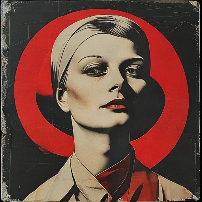
Russian Constructivist Sleeve (Rodchenko Register)
Source-image becomes a 1923 Moscow agitprop record jacket: diagonal red/black geometry, photomontage overlay, sans-serif slab fragments, the cover as collective signal.
The prompt
Render the source image in the visual register of a 1923-1925 Russian Constructivist record sleeve in the Rodchenko / Stenberg brothers lineage. Palette restricted to scarlet red, deep black, off-white paper, and a single accent of ochre or steel-blue. Strong diagonal compositional axis crossing the frame at roughly thirty degrees, hard-edged geometric shapes (circles, triangles, parallelograms) layered against the subject as photomontage cutouts rather than backgrounds. Heavy grain and visible halftone dot pattern as if printed on cheap newsprint stock. Subject treated with high-contrast cutout silhouette feel, edges crisp and slightly torn, paper texture reading through highlights. Square 12-inch LP-jacket framing where source aspect allows, otherwise preserve source aspect with constructivist border bars. Mood: collective, mobilized, urgent, mechanical, utopian. No legible text, no band name, no logos, no catalog marks. Preserve the subject, pose, and composition of the source image exactly, change only the medium and rendering.
What it is doing
The Constructivist sleeve is not about music. It is about recruiting the listener into a collective subject. Rodchenko stripped illustration to its agitprop bones because the goal was mobilization, not decoration. When a 2026 image borrows this register, it is borrowing the implicit claim that aesthetic form can summon a "we" out of an audience. Most pop sleeves that quote Constructivism (Franz Ferdinand, early 2000s indie) keep the diagonal grammar and discard the mobilization. The honest version of this register is uncomfortable: it asks who the viewer is being recruited for.
Tuning knobs
- Diagonal aggression: 30 degrees (default) to 60 degrees (more agitated)
- Photomontage density: single cutout (austere) to four-layer collage (full Rodchenko)
- Accent color: ochre (warmer/older) or steel-blue (more mechanical)
- Halftone coarseness: fine (modern print) to coarse newsprint (period-correct)
- Border treatment: clean bleed (modern) or constructivist bars top and bottom (period)
Style lineage
Learn the visual culture this draws from: Artnet.
Related prompts
See all 28 prompts in the Album-Cover grammar · Open in the gallery