Blue Note Reid Miles Jazz (Style-Only, Image-Conditioned)
Style register: Blue Note Records 1956 through 1967 grammar designed by Reid Miles, Francis Wolff studio portrait photography cropped and tinted, bold sans-serif typography acting as second instrument, the visual equivalent of hard bop.
The prompt
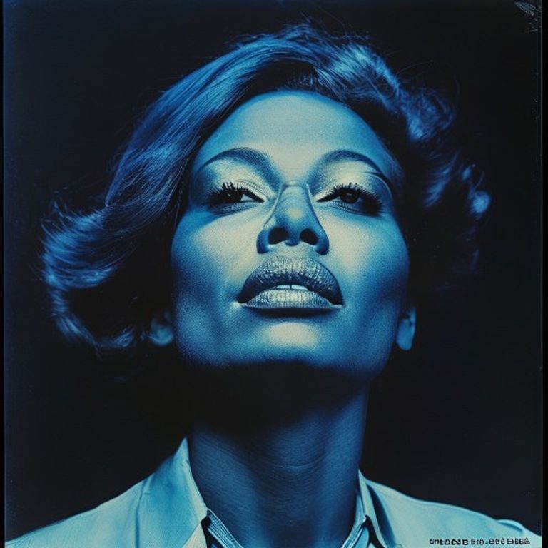
Re-render this image as a Blue Note Records LP jacket from the Reid Miles design era, between 1956 and 1967, in the visual register of Sonny Rollins Newk's Time, Hank Mobley Soul Station, Lee Morgan The Sidewinder, and Herbie Hancock Maiden Voyage. Source treated as a Francis Wolff style studio photograph: high-contrast monochrome silver gelatin print, deep blacks, bright whites, smoky mid-tones, single-source rim lighting from one side, the subject caught in a moment of attention rather than a posed smile. The photograph cropped tight and asymmetrically (often a slice rather than a full frame), bled to the edges of the cover, OR floated as a duotone tint inside a flat colored ground. Duotone treatment: black plus one accent color (cyan blue, brick red, ochre yellow, or pale green), the image NOT full-color, the limitation is the design. Flat color blocks of saturated mid-century palette (Pantone-era cyan, deep ochre, dusty pink, sage green) used as backgrounds for typography. Forbid hallucinating any legible band name, song title, or label text onto the canvas, but render the COMPOSITIONAL SPACE for it: a thick horizontal bar of solid color at the top or bottom where the typography would sit, OR a vertical column at the left edge. Texture: subtle paperboard grain visible in flat color areas, slight ink-on-cardboard absorption, faint registration variance between black plate and color plate. Square 12-inch LP-jacket aspect ratio. No legible text anywhere, no logos, no Blue Note bug, no Van Gelder studio mark, just the photograph and the typographic compositional space. Preserve the subject, pose, and composition of the source image exactly, change only the medium and rendering.
What it is doing
Reid Miles did not listen to the records he designed. He designed them as visual hard bop: bold, asymmetric, rhythmic, the typography placed exactly where a Lee Morgan trumpet stab would land. Francis Wolff's photographs caught Hank Mobley THINKING, not posing. Together they invented a visual language so tight that hearing the music and seeing the cover became one act. The Blue Note register is the proof that design CAN be the music.
Tuning knobs
- Duotone vs full crop: `duotone tint inside flat color ground` (signature) vs `full-bleed silver-gelatin black-and-white` vs `tight asymmetric crop on flat color`
- Accent color: `cyan` (signature for Lee Morgan era) vs `brick red` vs `ochre yellow` vs `pale green` vs `dusty pink`
- Typographic compositional space: `thick horizontal bar at top` (signature) vs `vertical left column` vs `corner block`
- Photograph subject affect: `caught thinking, eyes down or to side` (signature) vs `direct gaze` vs `mid-gesture`
- Crop aggression: `slice, not full frame` (signature) vs `full frame`
- Era register: `1956-62 Mobley/Rollins/Hank` vs `1963-67 Hancock/Shorter/Hutcherson modal era`
Style lineage
Learn the visual culture this draws from: Blue Note Records.
Related prompts
See all 28 prompts in the Album-Cover grammar · Open in the gallery