1920s Art Deco Luxury Automobile Streamline
The 1920s to 1930s art deco automobile advertisement: geometry and speed as status. The car as a vector in space, the design language that would define an era.
The prompt
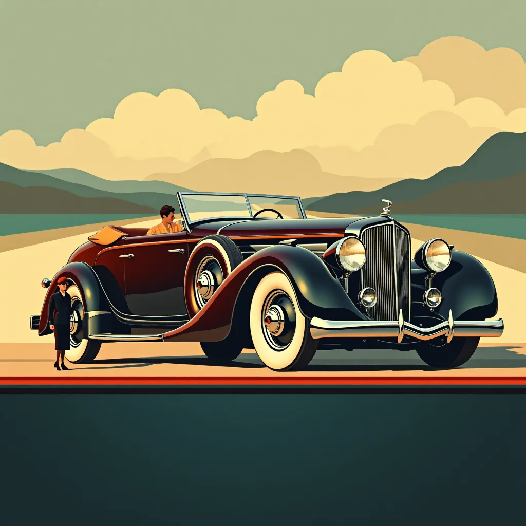
Restyle the source image as a 1925 to 1935 luxury automobile advertisement, the art deco streamline-moderne register. Render as a full-color magazine advertisement, printed on coated stock. The automobile is the absolute hero of the composition: rendered in three-quarter view or profile view, emphasizing the horizontal lines, the tapering hood, the windshield slope, the side molding geometry. Design language is pure art deco streamline moderne: horizontal emphasis, aerodynamic forms suggesting motion even at rest, chrome and polished metal catching light, the hood and fenders flowing as continuous curves. The body color is a rich jewel tone typical of the era: deep maroon, midnight blue, forest green, or rich burgundy, with bright chrome trim catching sharp highlights. The wheels are large, elegant spoke wheels or early wire wheels, polished and gleaming. The background suggests a stylized landscape or environment: perhaps a receding geometric road or a simplified natural vista with art deco treatment, rendered in complementary colors (pale cream, soft gold, light blue) with sharp angular composition suggesting depth and motion. The environment geometry is strictly controlled, suggesting the car's dominion over the landscape. A small human figure, if present, is dressed in 1920s fashion, the scale emphasizing the car's bulk and luxury. Light is sharp and directional, creating clean shadows and bright chrome highlights, emphasizing the form and geometry. The composition foregrounds the automobile's design language: wheels, molding lines, hood proportion, windshield angle. The negative-space top or bottom band: render as empty, no legible text, no brand name, no model designation, no pricing, no dealership information. Preserve the exact vehicle proportions, pose, and spatial arrangement of the source image without alteration; restyle the rendering only.
What it is doing
The 1920s automobile advertisement didn't sell transportation; it sold the geometry of speed as a class marker. The art deco streamline moderne design language said: if you could afford the shape, you could afford the speed, and the speed was freedom from the horizontal mass of ordinary people. The chrome was jewelry on the machine. The horizontal lines were visual velocity printed on the page. The car became beautiful not because it worked, but because it announced that you owned enough space and time to move through the world differently. Speed became a luxury, and luxury became something you could see.
Tuning knobs
- View angle: `profile-side-streamline-emphasis` vs `three-quarter-dynamic` vs `front-angled-approaching`
- Body color: `deep-maroon-classic` vs `midnight-blue-jewel` vs `rich-green-forest-luxe`
- Chrome treatment: `sharp-mirror-highlights` vs `glossy-saturated-shine` vs `metallic-accent-accents`
- Background environment: `abstract-geometric-deco` vs `stylized-landscape-racing` vs `minimal-neutral-studio`
- Human scale presence: `small-figure-emphasizing-bulk` vs `no-figure-car-alone` vs `proportioned-driver-visible`
Style lineage
Learn the visual culture this draws from: Art Deco Official Organization.
Related prompts
See all 23 prompts in the Vintage-Ad grammar · Open in the gallery