1960s Atomic-Age Kitchen Appliance Utopia
The atomic-era kitchen advertisement: chrome, Formica, and the promise that modernity would free women into a gleaming appliance-filled utopia. The futurism that doubled as a cage.
The prompt
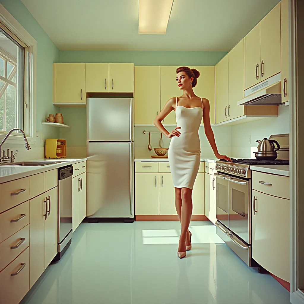
Restyle the source image as a 1960 to 1965 American magazine or brochure advertisement for kitchen appliances, the atomic-modernism utopian register. Render as full-color magazine spread or cover, printed for slick paper insert. Setting: a pristine, hyper-clean kitchen interior suggesting the future. Every surface is either stainless steel, enameled chrome, bright white Formica, or polished linoleum in pastels: pale mint green, soft coral, pale blue, light grey, with accents of warm yellow and chrome silver. The appliance(s) are centerstage: refrigerator, stove, dishwasher, coffee maker, all rendered as streamlined, curved, horizontal chrome-trimmed objects with sleek cabinet faces, minimal ornamentation. Design language is pure modernism: no applied ornament, form-follows-function promise, clean lines, horizontal emphasis. The kitchen geometry is precisely receding, suggesting depth through perspective and scale. The figure in the kitchen (if any) is a woman rendered in 1960s fashion, coiffed hair, makeup, minimal-motion posture, often touching or gesturing toward the appliance with pride or satisfaction. Light is bright, shadowless or nearly shadowless, suggesting daylight through a window or studio flash fill-lit photography. Color saturation is bright and clean, slightly desaturated enough to suggest the printed magazine register, offset litho on coated paper. There is zero clutter, zero wear, zero suggestion that actual cooking happens here. The negative-space band at the bottom or top: render as empty, no legible text, no brand slogans, no pricing, no model numbers, no product claims. Preserve the exact subjects, poses, gestures, and spatial arrangement of the source image without alteration; restyle the rendering only.
What it is doing
The atomic-kitchen advertisement sold modernity as a cage disguised as liberation. The chrome and Formica promised that the woman would be freed from drudgery through appliance efficiency. What it actually delivered was a new form of totalitarianism: the kitchen became a laboratory where the woman's role was to operate machines in a precisely designed space with zero tolerance for deviation. The appliances didn't free the labor; they made the labor invisible and redefined it as a privilege. The gleaming, shadowless surfaces were not a prediction of the future; they were a demand for conformity disguised as progress.
Tuning knobs
- Color palette: `mint-and-coral-pastel` vs `all-chrome-clinical-steel` vs `warm-yellow-and-white-cheerful`
- Appliance modernity: `early-1960-horizontal-streamlined` vs `mid-1960-curved-modern` vs `late-1960-tech-forward-angular`
- Figure presence: `woman-proud-posture` vs `woman-absent-implied` vs `no-human-figure-space-alone`
- Surface finish: `glossy-enamel-perfect` vs `matte-formica-utilitarian` vs `chrome-mirror-reflective`
- Depth receding: `shallow-focus-immediate` vs `steep-perspective-corridor` vs `isometric-geometric`
Style lineage
Learn the visual culture this draws from: National Women's History Museum.
Related prompts
See all 23 prompts in the Vintage-Ad grammar · Open in the gallery