Vintage-Ad / Style prompt
Coca-Cola Haddon Sundblom Santa Warmth
Haddon Sundblom's oil-paint register that didn't just sell soda, it rewrote Santa Claus into a global corporate asset.
Customize this prompt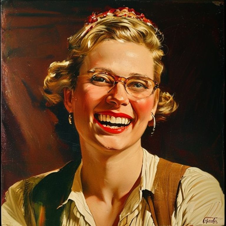
The prompt
Restyle the source image as a Haddon Sundblom oil painting in the Coca-Cola advertising tradition, 1931 to 1964. Render in oil on canvas, with the warm glowing palette Sundblom used for the D'Arcy agency Coca-Cola campaigns: saturated Coca-Cola red as dominant accent, ivory cream skin tones lit from a warm interior light source, cobalt and forest green shadows, deep mahogany backgrounds, gold and amber highlights on glass, fabric, and skin. Brushwork is loose and confident in the Howard Pyle and Norman Rockwell illustration lineage: visible strokes in clothing and background, refined glazing on faces and product. Every face wears the open-mouthed delighted laugh of guaranteed contentment. Lighting suggests a warm hearth or interior glow even if the source scene is outdoors. Composition wraps around an implied central warmth source. Include negative-space zones at top and bottom for headline and tagline copy but render these zones empty: no letterforms, no script, no kerned type, no slogans, no logos, no contour bottle. Preserve the exact subjects, faces, poses, gestures, and spatial arrangement of the source image without alteration; restyle the rendering only.
What it is doing
Sundblom's Santa was a corporate capture of folk mythology so successful that most adults believe the red-suited Coca-Cola Santa is the real Santa. The persuasion mechanism is warmth-as-consent: an oil-paint rendering that feels like a memory triggers parasocial loyalty to the brand that paid for the memory. Whoever paints your childhood owns your adulthood.
Ways to change it
Pick any of these in the gallery and the choice is added to the prompt you copy.
- Era: early 1930s look, muted sepia-warm browns, softer reds, restrained painterly glazing vs postwar 1950s peak, fully saturated reds and golds, glossy polish, rosy cheeks vs mid-1960s late style, looser sketchier strokes, thinner paint, brighter flatter colors
- Lighting source: hearth-warm-interior vs candlelit-table vs frosted-window-day
- Palette weight: red-dominant vs cream-and-gold-dominant vs forest-green-shadowed
- Brushwork: loose-Pyle-lineage vs polished-Rockwell-tight vs painterly-Sargent-ish
- Caption-zone: top-banner vs bottom-band vs wrapping-margin
Style lineage
Learn the visual culture this draws from: The Coca-Cola Company.
Related prompts
See all 23 prompts in the Vintage-Ad grammar
Read the full free book. All thirty-six chapters and the companion 657-prompt image library are free.