Video-Game-Case / Style prompt
TurboGrafx 16 HuCard Era
The subject rendered in the late-80s NEC TurboGrafx/PC Engine HuCard register, a flat solid-color marketing aesthetic for the also-ran platform.
Customize this prompt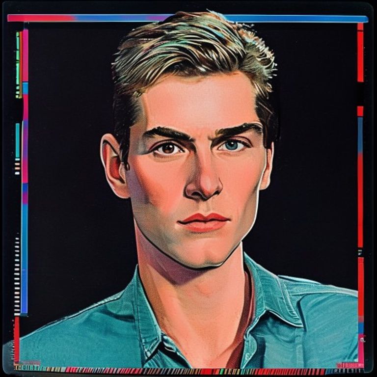
The prompt
Render the source in the visual lineage of late-1980s NEC TurboGrafx-16 and PC Engine HuCard era marketing art. Compose around a thin credit-card-format card aesthetic referenced through layout proportions rather than dimensions: dominant flat color background field, hand-painted or airbrushed subject treatment, bold geometric border ornaments in a contrasting solid color, small color blocks at top and bottom suggesting publisher and platform bands without text. Surface render: lightly glossy printed cardboard sleeve as if part of a HuCard manual cover or 1989 advertising spread. Use the period color register: maraschino red, cobalt, neon turquoise, hot magenta, deep black, with white negative space. Subject styled with airbrushed shading, hard color separations, slight halo or rim glow against the background. Slight color misregistration along high-contrast edges. Mood: the lost third platform of the bit wars, the underdog that knew it was an underdog and made art that was bolder for it. No legible on-canvas text, no logos, no named hate-symbols, no real-person defamation. Preserve the subject, pose, and composition of the source image exactly, change only the medium and rendering.
What it is doing
The TurboGrafx lost to Nintendo and Sega and that loss is exactly why its art holds up. A platform with nothing left to lose can take a stranger risk on a color decision. Every market eventually consolidates to two players and then to one and the third platform is always the most honest, because honesty is what you get to keep when victory is not on the menu.
Ways to change it
Pick any of these in the gallery and the choice is added to the prompt you copy.
- Color palette anchor: maraschino-red-dominant vs cobalt-dominant vs magenta-dominant
- Subject treatment: full-airbrush vs flat-cel-paint vs photographic
- Border ornament: thick-geometric vs thin-pinstripe vs ribbon-banner
- Background field: flat-single-color vs split-two-tone vs gradient
- Era variant: 1989 launch look: flat red and cobalt fields, simple airbrush, thin geometric borders (signature) vs 1991 peak look: neon turquoise and magenta gradients, heavy rim glow, chrome accents vs 1993 late look: darker palette, painterly detailed subject, moody black background
- Region Look: US release: black sleeve, gritty realistic airbrush painting, heavy cobalt border frame vs Japan import: white sleeve, bright anime-style cel art, candy-colored corner bands vs flat maraschino red field, airbrushed subject, turquoise and magenta geometric borders (signature)
Style lineage
Learn the visual culture this draws from: Cartridge Corner.
Related prompts
See all 26 prompts in the Video-Game-Case grammar
Read the full free book. All thirty-six chapters and the companion 657-prompt image library are free.