Yoshitaka Amano Final-Fantasy Watercolor Keyart Frame
The Yoshitaka Amano watercolor-and-ink register that defined the Final Fantasy keyart for two decades. The case in which the painted hero on the cover is a higher art object than the game it sells.
The prompt
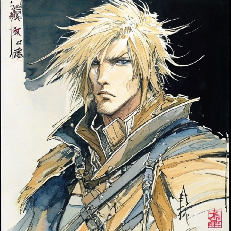
Re-render this image as a Yoshitaka Amano watercolor-and-ink illustration in the register he used for Final Fantasy keyart from 1987 to roughly 2004, sized and composed as if for a Japanese-market jewel-case insert or hardback art-book plate. Medium: watercolor on heavy cold-press cotton paper, applied with deliberate variation in wash density, dry-brush dragging across the paper's tooth in places, very wet pooled-pigment in others, the deliberate water-edge halos Amano allowed to form. Ink line work: Japanese-pen black ink, extremely fine, applied with calligraphic confidence, line weight modulated across each stroke, occasional dry-brush ink for hair and fabric edges, the line work clearly separate from the color underneath but composed to interact with it. Palette: a tightly restricted register, predominantly bone-white paper showing through, soft ochre and umber earth tones, occasional cool greys and slate blues, a single saturated accent color (vermilion red, indigo blue, or aged gold) used sparingly as the dominant emotional anchor. Composition: vertical portrait orientation, the hero figure occupying roughly half the picture plane, deliberately attenuated and elongated proportions in the Amano fashion (tall, thin, slightly androgynous, slightly otherworldly), surrounded by negative space the paper provides, with delicate ornamental elements (armor scrollwork, fabric folds, weapon detail, hair strands) drawn with the maximum care and detail Amano reserved for the figure itself. Background: largely bare paper with subtle watercolor wash, occasional environmental hint (a distant tower, a single tree, a wash of sky), the western pre-Raphaelite influence visible alongside the Japanese sumi-e tradition. Mood: melancholic, romantic, mythic, ceremonial, the painting that signals "this is a higher art object than the medium it's selling." Edge of the paper: visible deckled cold-press paper edge, slight age-toning. No on-canvas legible text, no logos, no franchise marks. Preserve the subject, pose, and composition of the source image exactly, change only the medium and rendering. Aspect ratio is vertical portrait suitable for game-package insert or art-book plate (roughly 5:7).
What it is doing
The Yoshitaka Amano Final Fantasy keyart is the foundational case study in painted-craft outlasting the digital product it served. The 1987 Final Fantasy I game is technically obsolete and functionally unplayable for most modern audiences. The 1987 Amano keyart for that game hangs in art museums and trades at auction. The painting is the durable asset. The game is the catalyst that created the demand. Square Enix has spent four decades trying to replicate Amano's craft anchor with successor artists (Tetsuya Nomura, Akihiko Yoshida) and never matched the watercolor-and-ink register's permanence. The lesson is that a craft-medium illustration can outlive the entire technical platform that generated its commission, and the buyer who paid for the original watercolor at auction in 1995 owns a sovereign object the original game disc cannot match.
Tuning knobs
- Pigment-saturation dial: `austere bone-white-and-umber` (canonical early Amano) vs `single-vermilion-anchor` (peak Amano FF6 era) vs `polychrome indigo-and-gold` (deluxe FF7 art-book era)
- Line-weight dial: `extremely fine consistent line` (canonical) vs `variable calligraphic line` (peak craft) vs `dry-brush-dominated edges` (gestural variant)
- Paper-stock dial: `bone-white cold-press cotton` (canonical) vs `cream-toned watercolor paper` (warm variant) vs `aged-grey hand-made paper` (relic variant)
- Negative-space dial: `predominantly bare-paper composition` (peak Amano restraint) vs `partial environmental-wash background` (mid-density) vs `full painted-environment background` (deluxe art-book plate)
- Figure-proportion dial: `elongated-attenuated androgynous` (canonical Amano figure) vs `slightly less stylized` (early-career) vs `extremely stylized to abstraction` (late-career experimental)
- Edge-finish dial: `deckled cold-press paper edge visible` (gallery-grade) vs `trimmed straight edge` (publication-grade) vs `mounted on aged board with visible margin` (museum-grade)
Style lineage
Learn the visual culture this draws from: Cook and Becker.
Related prompts
See all 26 prompts in the Video-Game-Case grammar · Open in the gallery