Barbie Pink Window-Box Aspirational Frame
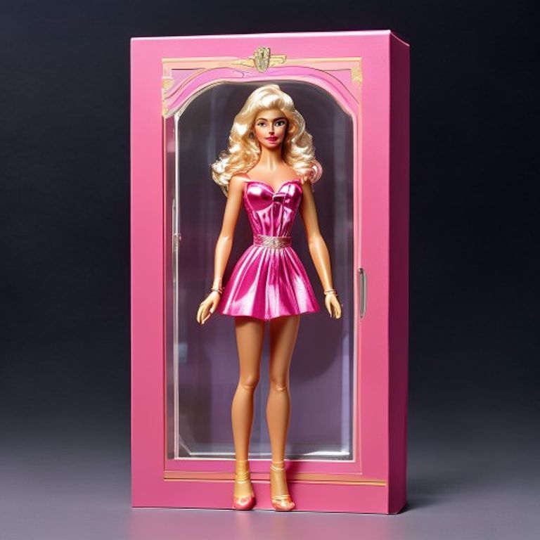
The Mattel Barbie window-box package, dominant pink palette, clear-window front face displaying the doll inside in full aspirational composition. The most successful color-claim in toy-packaging history.
The prompt
Re-render this image as a 1980s to 1990s Mattel Barbie retail window-box package, the canonical format Mattel established for the doll's mainline SKUs and that defined girls'-aisle visual identity for two generations. Package format: a rigid coated-cardboard rectangular box (approximately 19cm wide by 33cm tall by 8cm deep), full-color offset-litho printed on all five visible faces, with a large clear acetate window cut into the front face that reveals the doll positioned inside the box, the doll secured by interior clear-plastic ties and a printed cardboard interior backdrop. Front face surrounding the window: dominated by saturated Mattel-Barbie-canonical pink (the trademarked Pantone-219-adjacent hot-pink that became the brand's most defended color asset), often with secondary palette elements (silver-metallic accents, soft-violet gradient, gold-foil starburst details, all rendered as flat colored shapes with no legible text). Top edge: a thick pink title-band stripe with a stylized scroll-or-banner element (render as flat solid pink rectangle with optional small flat colored shape, no legible lettering). The clear acetate window: large central rectangular opening (approximately 14cm wide by 22cm tall), through which the doll inside is fully visible, positioned in an idealized standing-pose or seated-pose against an interior printed cardboard backdrop (gradient-pink, soft-cloud, palace-interior, or fashion-show-stage depending on SKU). Interior printed backdrop visible through window: the aspirational context-setting illustration that places the doll in her sub-line environment. Lower portion of front face: a thin pink character-name band beneath the window (render as flat solid pink rectangle). Side panels: continuation of the pink-dominant register with secondary photographs or illustrations of the doll in alternate outfits and accessories (the famous Barbie "more sold separately" wave), plus colored icon-strips showing accessory inclusions (render as small flat colored rectangles). The box itself: gloss-laminated UV-coat over offset litho, slight reflection, sharp four-color registration, the acetate window heat-sealed into the cardboard die-cut. Mood: 1987 girls'-aisle, fully aspirational, the pink color-claim as the dominant brand-language asset, the doll inside visible as the contract Mattel makes with the buyer. No on-canvas legible text, no logos, no franchise marks. Preserve the subject, pose, and composition of the source image exactly within the window display, change only the medium and rendering of the surrounding package. Aspect ratio is Barbie window-box vertical portrait (roughly 3:5, tall and narrow).
What it is doing
The Mattel Barbie window-box is the most successful color-claim in toy-packaging history. Mattel spent decades trademarking, defending, and reinforcing one specific shade of pink (Pantone 219 and its production-adjacent variants) until the color itself became inseparable from the brand. A child or parent walking the toy aisle in 1989, 1999, 2009, or 2019 could identify the Barbie section from across the store by color alone. The aspirational-window format reinforces this: the buyer can see the doll inside through the clear acetate, but the doll is presented in an idealized context with accessories and outfits the package promises (some included, most "sold separately"). The window is therefore both a transparency contract (you can see what you're getting) and an aspirational frame (the doll is presented in her best context, surrounded by what she could become). The brand has compounded this color-claim plus aspirational-window grammar into one of the most defended physical-toy positions in the world, and the "sold separately" footnote on the package back is the engine that converts a single doll purchase into a lifetime accessory subscription.
Tuning knobs
- Pink-saturation dial: `Mattel-canonical hot-pink Pantone-219 register` (peak brand-claim) vs `softer-rose pastel register` (1990s adult-collector variant) vs `magenta-metallic glitter register` (special-edition deluxe SKU)
- Window-format dial: `large central rectangular acetate window` (canonical) vs `shaped die-cut window with curves` (special SKU) vs `dual-window front face with twin dolls` (giftset SKU)
- Interior-backdrop dial: `gradient-pink soft-cloud backdrop` (canonical) vs `palace-interior or fashion-show-stage backdrop` (deluxe SKU) vs `printed-environmental scene with accessories laid out` (playset SKU)
- Era-register dial: `1980s heavy-saturation register with airbrush-illustration accents` (vintage canonical) vs `1990s photographic-and-illustration hybrid` (mid-cycle) vs `2010s minimalist-modern register with cleaner typography zones` (contemporary)
- Accessory-icon dial: `dense icon-grid of included accessories` (canonical "everything included" register) vs `sparse icon-row` (austere SKU) vs `"sold separately" callout band promoting expansion line` (lifetime-collector register)
- Shelf-wear dial: `mint sealed in original cellophane` vs `light box corner-wear with intact acetate window` (lived-in) vs `acetate window scratched or crushed plus price-sticker residue` (relic)
Style lineage
Learn the visual culture this draws from: Rockridge Law.
Related prompts
See all 8 prompts in the Toy-Packaging grammar · Open in the gallery