Chartres Blue Gothic Lancet (Style-Only, Image-Conditioned)
Style register: Thirteenth-century Chartres lancets, saturated cobalt pot metal and fired grisaille held within muscular lead and stone tracery.
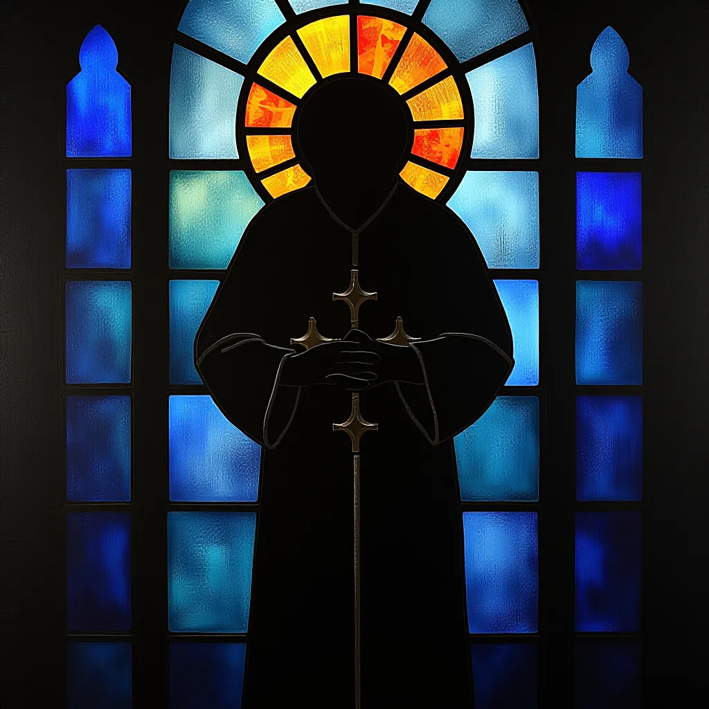
The prompt
Re-render this image as a thirteenth-century Chartres cathedral lancet window, translating its existing subject into large pieces of mouth-blown pot-metal glass. Keep the subject's recognizable silhouette and spatial arrangement, but articulate every major shape with bold, dark lead cames, thick enough to read at thumbnail scale. Set the figure or primary object in a tall pointed-arch visual rhythm without changing the source frame; suggest the lancet through an inner border of broad leaded panels. Let Chartres blue carry the deep fields, with ruby, honey amber, and pale milky glass reserved for decisive accents. Fire dark iron-oxide grisaille onto the glass for a few broad folds, faces, or contours, then show where a brush dragged softly across the still-wet pigment. Light enters from behind rather than shining on the surface. Glass varies in thickness, making blues pool darker at their edges and lighter through their centers. Keep masonry only as a restrained outer suggestion, never a new setting that replaces the source. Avoid tiny mosaic pieces: make each colored region feel cut by hand and held under pressure. The mood is solemn, luminous, and architectural, with strong dark boundaries holding the light in place. Leave a calm, uncluttered band of negative space along the top or bottom edge where a title could sit. Strictly no on-canvas text, no legible lettering, no signature, no watermark, no logos. Preserve the subject, pose, and composition of the source image exactly, change only the medium and rendering. Aspect ratio matches source.
What it is doing
Chartres blue is not merely a color. Its force depends on a dark wall, strong lead seams, and transmitted daylight, turning apparent enclosure into an instrument of illumination.
Tuning knobs
- Blue density: `deep cobalt` (signature) vs `lighter sapphire` vs `near-black midnight blue`
- Lead width: `bold structural seams` (signature) vs `medium hand-cut seams` vs `extra-heavy lattice`
- Accent glass: `ruby and honey amber` (signature) vs `amber only` vs `ruby only`
- Paint firing: `broad iron-oxide grisaille` (signature) vs `minimal brushwork` vs `strong shaded folds`
Related prompts
See all 10 prompts in the Stained-Glass grammar · Open in the gallery
Get the free sample. The intro plus the first three chapters of The Liberation Engine, delivered as a PDF. The full book and the complete 642-prompt method are the paid edition.