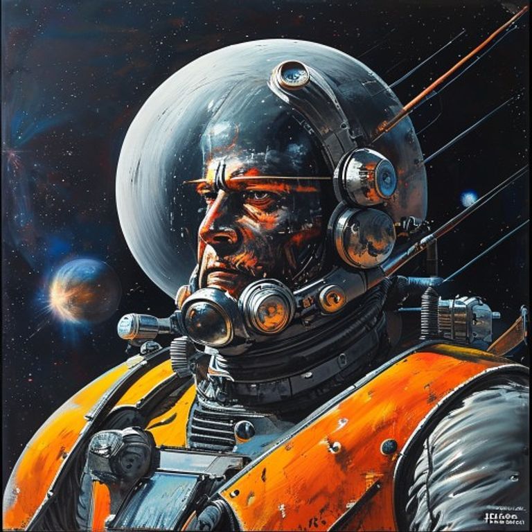
Chris Foss 70s Paperback Spaceship Acrylic Frame
The Asimov-Foundation paperback-cover spaceship register. Massive striped hulls, no humans visible, planet-as-backdrop, acrylic-on-board, the 1970s pulp-cathedral on every supermarket bookshelf.
The prompt
Re-render this image in the style of Chris Foss paperback sci-fi cover illustration, acrylic-on-board lineage from his Asimov, Heinlein, Brian Aldiss, and EC Tubb cover work circa 1972 through 1979. Medium: acrylic paint on illustration board, hand-rendered with airbrush for atmospheric gradients and brush for hard-edge mechanical detail, fine pinstriping for hull-panel definition. Surface treatment: massive metal hull dominant, with diagonal hazard-stripe paint schemes in saturated industrial palette (warning-orange, gloss-black, lemon-yellow, fire-engine red, occasional cobalt accent), heavy-duty rivet detail, exhaust nozzles glowing pale-blue or warm-yellow, antenna arrays and sensor-pods bristling. Composition: subject occupies majority of frame with deliberate scale-overwhelm, planet-curve or moon-surface in background providing scale-context, NO human figures visible (humans inappropriate to Foss register), distant secondary craft tiny for additional scale-cue. Lighting: single strong key-light from off-frame star (cool-white or warm-yellow), producing crisp specular on hull-edges and deep shadowed undersides, secondary planet-reflected fill on shadow side. Atmosphere: hard vacuum, occasional engine-glow particle trail, faint nebula gradient in deep background. Color palette: high-saturation industrial paint scheme over gray-metal substrate, sky black with subtle gradient toward planet-glow horizon, NO muted or naturalistic tones. Mood: heroic-scale industrial vessel rendered as pulp-cathedral object, the supermarket-paperback register of 1970s sci-fi mass-market publishing, the engineering brochure mated to the adventure novel cover. Rendering precision: hard-edge masking on hull geometry, soft airbrush on atmospheric gradient, fine brush for warning-stripe paint and rivet-detail, signature Foss obsession with mechanical specificity. No legible text, no studio watermark, no readable warning-stripe lettering. Aspect ratio matching source. Preserve the subject and composition of the source image exactly, change only the medium and rendering.
What it is doing
Chris Foss painted spaceships that were never in the books they covered. The publishers did not care. The cover sold the paperback regardless of internal correspondence. The Foss register is the pulp-cathedral version of Baudrillard's argument: the cover is the actual product, the novel is the loss-leader. Applied to any contemporary subject, the Foss frame encodes the buried thesis that the surface presentation, hazard-striped and brochure-monumental, is the load-bearing artifact and the underlying substance is irrelevant supporting documentation.
Tuning knobs
- Hull-scheme dial: `warning-orange-and-black diagonal stripes` vs `lemon-yellow over gray-metal` vs `fire-engine-red panels with cobalt accent`
- Background dial: `planet curve dominant` vs `moon surface low horizon` vs `deep nebula with no planet`
- Scale-cue dial: `tiny secondary craft for scale` vs `no scale-cue, pure object` vs `surface-installation visible on planet`
- Engine-glow dial: `pale-blue plasma exhaust` vs `warm-yellow chemical exhaust` vs `no engine, drift-state`
- Era-purity dial: `1972 early-Foss simpler palette` vs `1976 peak-Foss high-saturation` vs `1979 late-Foss with subtle cinematic darkening`
Style lineage
Learn the visual culture this draws from: Science Fiction Encyclopedia.
Related prompts
See all 5 prompts in the Sci-Fi-Concept grammar · Open in the gallery