Risograph Two-Color Underground Press
The Risograph-printed art-school-meets-anarchist-infoshop two-color register, misregistered on purpose, grainy on principle.
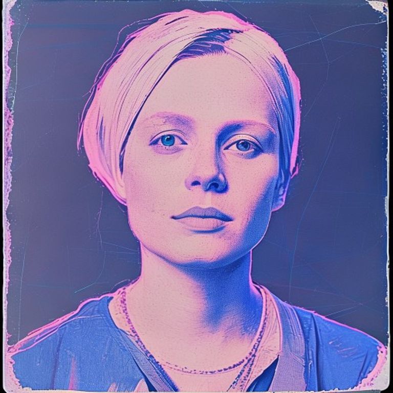
The prompt
Render in the visual register of a contemporary Risograph print, the soy-ink stencil duplicator favored by anarchist infoshops, art-school zinesters, mutual-aid newsletters. Medium: two-color Riso overlay using fluorescent pink and federal blue, with deliberate misregistration of three to six millimeters between layers creating ghost halos around forms. The line quality is granular and slightly soft, with the characteristic Riso grain visible as a fine speckled texture across all flat areas. Add the soy-ink ridge buildup at the edges of dense areas where the master left more ink. Palette: untreated cream paper base, electric fluoro-pink layer (the Riso pink that has no equivalent in CMYK), deep federal blue layer overlaying to create muddy purple in overlap zones. Texture: paper has the slight tooth of uncoated stock, with characteristic Riso transfer streaks along the trailing edge. Lighting: studio flat, evenly lit. Mood: amateur-craft pride, the dignity of the medium that rejects perfection, the contemporary heir to mimeograph. Do not render any legible text, slogans, logos, watermarks, named hate symbols, or defamatory likeness of real persons; all surface marks are abstract color-field texture only. Preserve the subject, pose, and composition of the source image exactly, change only the medium and rendering.
What it is doing
The Risograph misregisters on purpose because perfect registration is the lie of corporate print. The ghost halo around every form is a confession that this was made by a person on a machine that costs less than a used car. The two-color limit forces the maker to choose what matters, and choosing what matters is the first political act after acquiring a press. The Riso is the mimeograph for people who never had a mimeograph.
Tuning knobs
- Color pair: fluoro-pink + federal-blue vs sunflower + medium-green vs purple + teal
- Misregistration distance: 2mm tight vs 6mm loose vs deliberately-wild 15mm
- Grain density: fine vs medium vs coarse-pixelated
- Paper: cream uncoated vs craft brown vs French speckletone
- Layer order: pink-then-blue vs blue-then-pink (changes overlap muddy zones)
- Era: 90s zine vs 2010s art-school vs contemporary mutual-aid
Style lineage
Learn the visual culture this draws from: Split Arrow Print House.
Related prompts
See all 10 prompts in the Samizdat-Zine grammar · Open in the gallery
Get the free sample. The intro plus the first three chapters of The Liberation Engine, delivered as a PDF. The full book and the complete 557-prompt method are the paid edition.