Soviet Onionskin Typescript Samizdat
The carbon-copy typewriter feel of clandestine Moscow-kitchen literature, sixth-generation degraded and still readable.
The prompt
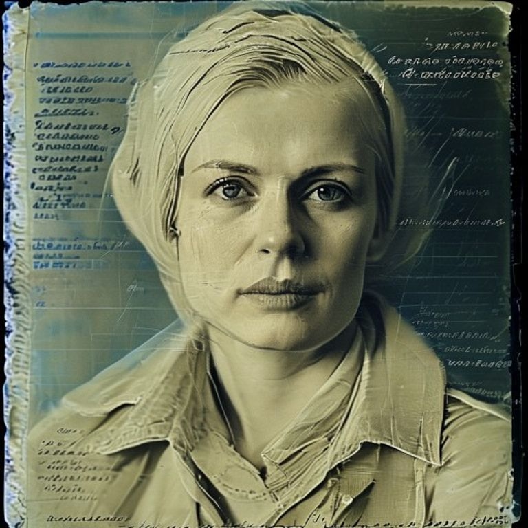
Render in the visual register of a 1970s Soviet samizdat carbon-copy typescript on translucent onionskin paper. The medium feel is a manual typewriter (Erika or Moskva 5) struck through five sheets of carbon, so the impression is uneven, some letters bold and others ghosted, with the characteristic strikethroughs and overstrike corrections of a typist working at speed under risk. Palette: warm bone-white or yellowed-cream paper base, near-black typewriter ink with cool-blue carbon-paper bleed in the deeper strokes, faint coffee-ring or tea stain at one edge. Texture: paper grain visible, micro-creases from being folded into a coat pocket, the translucent quality of onionskin showing faint shadows of typescript on the reverse. Lighting: flat, single overhead bulb on a kitchen table, no glamour. Mood: quiet courage, the dignity of cheap reproducible media, the texture of risk. Do not render any legible words, sentences, headlines, logos, watermarks, named hate symbols, or any defamatory likeness of real persons; treat all text-feel as abstract typewriter rhythm and ink texture only. Preserve the subject, pose, and composition of the source image exactly, change only the medium and rendering.
What it is doing
The medium that survives confiscation is the medium that degrades gracefully. Samizdat was copied by hand on whatever paper and whatever typewriter could be found, and each generation lost fidelity but gained authenticity. The smudge proves a person risked something to make this copy. Centralized glossy media collapses when the printing press is seized; the kitchen typewriter cannot be seized because every kitchen has one. Cheap, reproducible, degradable media is the parallel-state press, and the parallel state is the only real opposition.
Tuning knobs
- Generation depth: first carbon (crisp) vs third carbon (faded) vs sixth carbon (ghost trace)
- Paper: onionskin translucent vs bond cream vs newsprint scrap
- Typewriter brand feel: Erika even-strike vs Moskva 5 uneven vs Underwood Cyrillic
- Stain set: clean vs tea-ring vs cigarette burn vs water-damage curl
- Annotation marks: clean typescript vs pencil margin notes vs red-pen censor strikes
- Era: 1960s pre-detente vs 1970s Brezhnev stagnation vs 1980s perestroika edge
Style lineage
Learn the visual culture this draws from: Britannica.
Related prompts
See all 10 prompts in the Samizdat-Zine grammar · Open in the gallery