Fluorescent Two Ink Misregistration (Style-Only, Image-Conditioned)
Style register: two separate fluorescent pink and blue stencil drums, precision plate planning interrupted by the visible drift of an actual paper feed.
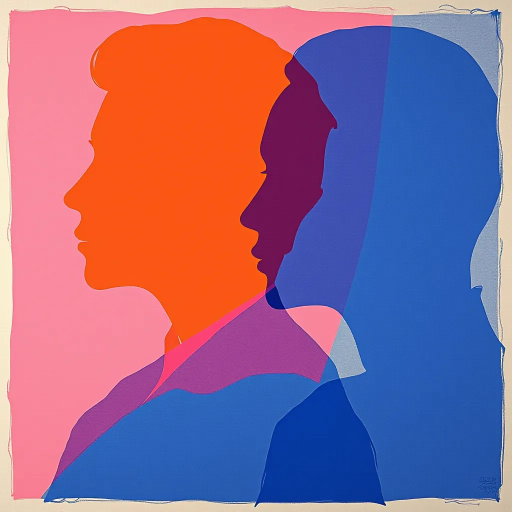
The prompt
Re-render this image as a two-ink risograph print made on a stencil duplicator, in the experimental printmaking register of Corita Kent's color separation and contemporary independent riso workshops. Translate the source into two deliberately planned masters: fluorescent pink carries broad warm masses and open highlights, while dense process blue carries the structural outlines and dark planes. Let bare ivory paper serve as the third color. Pass each sheet through the machine twice, with the blue drum shifted slightly right and down from the pink, leaving clean, visible pink fringes along large silhouettes and blue fringes on the opposite side. Where inks overlap, build a saturated violet that is visibly made from two transparent layers rather than a flat digital swatch. Keep large shapes legible at thumbnail size; confine registration slips to broad contours, not a noisy all-over blur. Show slight stencil softness, ink pressure variation, and the dry fiber of uncoated paper in areas of thin coverage. Compose the existing forms as a quiet color-separation study, not a political flyer or a page of collage. Leave a calm, uncluttered band of negative space along the top or bottom edge where a title could sit. Strictly no on-canvas text, no legible lettering, no signature, no watermark, no logos. Preserve the subject, pose, and composition of the source image exactly, change only the medium and rendering. Aspect ratio matches source.
What it is doing
A color separation is an interpretation, not a neutral translation. The fringe at each edge lets the viewer see two independent decisions and the imperfect mechanical passage that joined them. This is a study in how color is assembled, rather than the underground pamphlet language of the neighboring Samizdat-Zine treatment.
Tuning knobs
- Plate shift: `small right-and-down drift` (signature) vs `near-perfect alignment` vs `pronounced offset on broad shapes`
- Pink coverage: `large warm masses` (signature) vs `thin outline only` vs `nearly full-bleed wash`
- Blue density: `dense structural planes` (signature) vs `airy midtone veil` vs `blue only in shadows`
- Overlap: `saturated transparent violet` (signature) vs `sparse overlap` vs `deep violet focal cluster`
- Paper: `dry ivory uncoated` (signature) vs `bright white uncoated` vs `warm recycled fleck`
Related prompts
See all 10 prompts in the Risograph grammar · Open in the gallery
Get the free sample. The intro plus the first three chapters of The Liberation Engine, delivered as a PDF. The full book and the complete 642-prompt method are the paid edition.