Movie-Poster / Style prompt
Studio Ghibli Theatrical
Studio Ghibli theatrical poster tradition (1987 onward, hand-painted feature animation). Painted animation art as fine-art poster, soft pastel or watercolor sensibility, luminous color.
Customize this prompt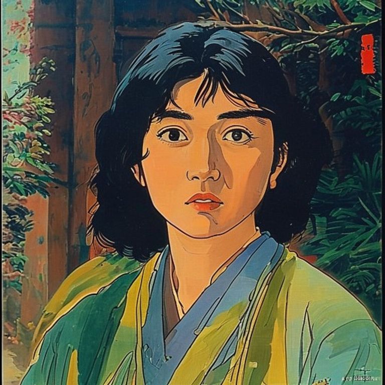
The prompt
Re-render this image in the visual register of Studio Ghibli theatrical poster painting (1987 onward, feature films from Nausicaa through Spirited Away). Painted in the style of animation backgrounds and character art: soft gouache, watercolor, or acrylic layered with transparency, the surface reading as gallery-quality illustration rather than photorealism. Figures rendered with anatomical sensitivity and emotional clarity, faces expressive and often frontally lit, eyes luminous and primary to the composition. Palette warm and saturated but not neon: soft earth tones, jewel tones at moderate saturation, warm skin tones, sky blues, forest greens, occasional accent colors (rust, deep purple, warm gold) used sparingly for emotional emphasis. Lighting naturalistic and often magical: warm and directional as if from memory, soft rim light separating figures from background, the whole scene glowing as if illuminated by an interior light rather than exterior sun. Background painted with texture and depth: architectural or landscape elements rendered with respect for perspective but often slightly softened or painterly, occasionally incorporating traditional Japanese rendering techniques, the environment as important as the figure. Composition: often a group or ensemble arranged with care for balance and emotional relationship, figures positioned to admit the full frame without crowding, the negative space as lyrical. Surface: visible brushwork in a controlled and sensitive manner, paint layering creating depth and texture, matte finish suggesting paper or canvas, the image surface as a beautiful thing in itself. Mood: tender, wondrous, slightly elegiac, the interior made visible as landscape. Strictly no on-canvas legible text, no Japanese lettering, no title cards, no studio marks, no watermark. Preserve the subject, pose, and composition of the source image exactly, change only the medium and rendering.
What it is doing
Saturated cinematic color can express longing. Ghibli posters render the world as animation does: soft, impossible, and true. What live-action refuses to admit (the wonder, the sadness, the animation of the natural world, the possibility of flight), painting admits without apology. The studio's posters are not promotions, they are paintings that happen to advertise films. The audience comes back to the poster to feel the glow that the film contained. Animation permits what realism forbids: tenderness at full saturation.
Ways to change it
Pick any of these in the gallery and the choice is added to the prompt you copy.
- Era dial: 1987 Nausicaa painterly vs 1997 Mononoke romantic vs 2001 Spirited Away baroque
- Palette register: warm earth and sky vs jewel tones moderate saturation vs accent colors emotional key
- Figure rendering: realistic proportions vs stylized expressionist vs near-abstract flowing forms
- Background treatment: soft atmospheric field vs detailed landscape with perspective vs environmental elements almost equal to figure
- Magical lighting dial: naturalistic warm directional vs glowing interior source vs luminescence without visible source
Style lineage
Learn the visual culture this draws from: Little White Lies.
Related prompts
See all 34 prompts in the Movie-Poster grammar