A24 Arthouse Modern Minimal
Contemporary independent distributor aesthetic (2010s onward, A24 sensibility). Negative space as subject, isolation as framing device, typography as mood.
The prompt
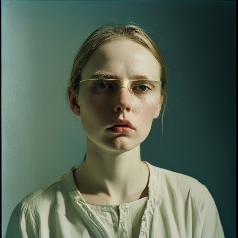
Re-render this image in the visual register of contemporary A24 arthouse cinema marketing (2010s onward, indie distributor sensibility). Treat the composition with radical negative space: the subject occupies only a modest portion of the frame, usually centered or off-center at the architectural rule of thirds, surrounded by large areas of uniform or very subtly modulated color field. Palette restrained and desaturated: off-white, cream, pale gray, dusty sage, muted terracotta, or a single soft monochromatic tone, often with a single accent color (rust, deep teal, acid green, or ochre) introduced sparingly. Lighting naturalistic and often strange: the subject lit as if caught in a moment of private transition, often with odd rim lighting or directional light that creates shadow without drama. Surface treatment: slight photographic grain, or painted/printed quality suggesting silkscreen or lithograph, matte finish, the image surface slightly visible as a material thing rather than a window. Composition: the emptiness around the subject is active, the frame designed to make the viewer aware of the viewing frame itself. Typography, if present, integrated into negative space, large and often asymmetric, lettering rendered as simple outline or stencil, never decorative. Mood: restrained, queasy, alien intimacy, the subject isolated in a space that is both intimate and vast. Texture: subtle, almost imperceptible, never theatrical. Strictly no on-canvas legible text (titles, credits as rendered text forbidden), no logos, no studio marks, no watermark. Preserve the subject, pose, and composition of the source image exactly, change only the medium and rendering.
What it is doing
Curtis taught us that the minimal frame is an argument about attention. The A24 poster takes the subject and isolates it in negative space so severe that the frame itself becomes the subject. The emptiness is not decoration, it is psychology. The viewer learns to feel the weight of what is not there. Scale disappears, and what remains is the moment of rupture, cut to size. The margin is the meaning.
Tuning knobs
- Negative space dial: `50% empty` vs `70% empty` vs `subject nearly lost at 85% empty`
- Palette register: `off-white and single accent` vs `monochromatic field` vs `two desaturated colors in tension`
- Accent color: `rust` vs `deep teal` vs `acid green` vs `ochre`
- Lighting dial: `naturalistic flat` vs `odd directional rim light` vs `almost silhouette shadow`
- Surface texture: `slight photographic grain` vs `subtle printed texture` vs `almost imperceptible`
Style lineage
Learn the visual culture this draws from: A24 Shop official site.
Related prompts
See all 34 prompts in the Movie-Poster grammar · Open in the gallery
Get the free sample. The intro plus the first three chapters of The Liberation Engine, delivered as a PDF. The full book and the complete 557-prompt method are the paid edition.