Futurism / Style prompt
Marinetti Parole in Libertà: Typographic Explosion Field
Marinetti's words-in-freedom mode treated as a pure visual texture, type as shrapnel, page as battlefield.
Customize this prompt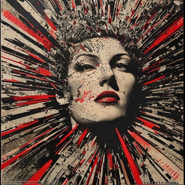
The prompt
Re-render this image in the visual register of Filippo Tommaso Marinetti's parole in libertà broadsides circa 1914 to 1919, as if it were composed of typographic shrapnel arranged into a battlefield field-pattern. The texture is dense ABSTRACT typographic ornament made from non-legible letter-shaped marks, slab-serif and bold-condensed fragments, asterisks, vector arrows, dashes, parentheses, brackets, and pointing fingers, oriented at every angle including upside down and 45 degree diagonal. Treat the letter-shapes as pure ornament and texture only, no readable words. Palette of ink black, manifesto red, kraft cream, and newsprint grey. Composition is centripetal explosion radiating from the subject. Surface reads as letterpress on cheap newsprint with ink bleed and offset misregistration. Strictly no on-canvas text, no legible lettering, no signature, no watermark, no logos. Preserve the subject, pose, and composition of the source image exactly, change only the medium and rendering. Aspect ratio matches source.
What it is doing
Marinetti claimed words-in-freedom liberated language from grammar. They did the opposite. They liberated attention from meaning. Once the eye is trained to consume typography as visual sensation instead of argument the path is clear for any slogan to bypass thought. Marinetti himself wrote the Fascist Manifesto in 1919, five years after this typographic style was perfected. The form was the recruitment device.
Ways to change it
Pick any of these in the gallery and the choice is added to the prompt you copy.
- Letter density: sparse poster vs dense newsprint vs total ornament field
- Diagonal aggression: mild tilt vs 45 degree classic vs all angles maximum
- Palette weight: ink black dominant vs manifesto red dominant vs cream and grey neutral
- Press quality: crisp lithograph vs offset misregister vs wartime degraded
- Ornament vocabulary: arrows and asterisks vs slab-serif fragments vs mixed full vocabulary
Style lineage
Learn the visual culture this draws from: Britannica.
Related prompts
See all 12 prompts in the Futurism grammar
Read the full free book. All thirty-six chapters and the companion 657-prompt image library are free.