Rothko Color Field Abstraction (Style-Only, Image-Conditioned)
Style register: Mark Rothko 1949-1970, the subject rendered as stacked horizontal color rectangles in saturated oil, the painting as a direct assault on the nervous system, emotion as the only content.
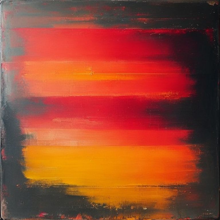
The prompt
Re-render this image as a Mark Rothko color field painting from the classic series, circa 1949 to 1960. The entire canvas filled with two or three stacked horizontal color rectangles in oil paint, large soft-edged fields of pure, luminous color creating an optical glow at their boundaries. No gestural mark-making, no internal detail, no composition beyond the vertical stacking of hue against hue. Each color field a single coherent value applied with brush gestures so layered and subtle they become invisible, the surface reading as pure color rather than paint. Color choices create an emotional register: a red so deep it borders on black with a warm ochre above it (elegy), or a magenta-black with a bruised mauve (violence), or a pale yellow above a vibrant orange (ecstasy). The soft edge where colors meet achieved through multiple transparent glazes and wet-into-wet blending, never a hard line, the boundary atmospheric and active. Canvas scale implied to be large (monumental). Aspect: overwhelming, intimate, confrontational, the color entering the body not the eye alone. No on-canvas text, no signature legible, no geometric precision. Preserve the subject, pose, and composition of the source image exactly, change only the medium and rendering.
What it is doing
Rothko insisted his paintings had "no relations to the world whatsoever." The viewer was meant to stand in the painting's emotional field the way you stand in weather. The color moves, trembles at the edge, shifts under the gaze in ways the rational mind cannot account for. This is not decoration. This is not illustration. This is the nervous system recognizing that color is matter, and matter is spiritual if you pay attention. Rothko's suicide in 1970 was not a separate fact from the paintings; it was the paintings' conclusion made literal.
Tuning knobs
- Hue pairing: `complementary high-saturation contrast` (signature) vs `analogous close-value harmony` vs `monochromatic shifting intensity`
- Number of fields: `three horizontal stacked rectangles` (signature) vs `two` vs `four or more`
- Edge softness: `feathered soft-edged transitions` (signature) vs `hard edge` vs `blurred gradient`
- Color temperature: `warm (red, orange, ochre)` vs `cool (blue, purple, grey)` vs `warm-cool tension across divide`
- Luminosity: `maximum chromatic saturation` (signature) vs `muted earth tones` vs `high-key pale values`
- Gesture visibility: `invisible brushwork, pure color field` (signature) vs `visible gestural marks` vs `visible drips or accidents`
Style lineage
Learn the visual culture this draws from: American Abstract Expressionist (1903–1970).
Related prompts
See all 20 prompts in the Fine-Art grammar · Open in the gallery