1960s Underground Comix with Dense Engraving-Style Crosshatching
1960s Haight-Ashbury underground-comix crosshatch register, ugly-truthful in dense dip-pen and engraving-style ink.
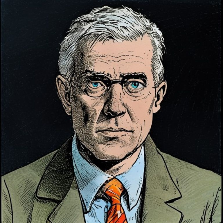
The prompt
Render in the medium and register of 1960s underground-comix work (Zap Comix, Mr. Natural, Fritz the Cat period through the Weirdo years): dip-pen and India ink on Bristol board with later flat-color spot fills (or pure black-and-white linework with no color at all), linework built entirely of dense fine crosshatching and parallel-line shading in the manner of nineteenth-century engraving translated through 1960s American comics culture, every form modeled through hatch density not flat black, contour lines varied in weight (heavier on the shadow side, lighter on the lit side), figure proportions slightly exaggerated toward grotesque (legs slightly too long, feet slightly too large, jaws and cheeks slightly too prominent), facial expressions pushed past comic-naturalism into uncomfortable realism (every wrinkle, every body-flaw, every unflattering angle rendered), palette when color is present limited to comix-newsprint flat fills (sky-blue, brick-red, school-yellow, grass-green, flesh-pink) with no gradient and no rendering, panel feel of late-1960s San Francisco countercultural self-publishing, the visual register of an artist who refuses to flatter the subject, slight newsprint-yellowing of the implied substrate. Do not render legible on-canvas text, logos, watermarks, named hate-symbols, or any real person depicted defamatorily. Preserve the subject, pose, and composition of the source image exactly, change only the medium and rendering.
What it is doing
The engraving-style underground-comix line refuses to flatter. Mainstream illustration flatters because the client pays for flattery and the artist learns that flattery is the price of the gig. Self-published underground comix refused most commercial conventions and rendered every subject at maximum unflattering precision. The crosshatch is the formal commitment to unflattering truth: every wrinkle gets a line, no smoothing pass, no instagram filter, no euphemism. The reason most contemporary portraiture feels weightless is the flattery is baked into the contract before the pencil hits paper.
Tuning knobs
- hatch-density: sparse-line vs medium-cross vs full-engraving-tonal-build
- color-presence: pure-black-and-white vs limited-flat-spots vs full-comix-flat-fill
- exaggeration-level: mild-naturalist vs medium-pushed vs full-grotesque
- newsprint-aging: fresh-bristol vs slightly-yellowed vs heavily-aged-comix
- contour-weight: uniform-thin vs varied-shadow-heavy vs heavy-outline-throughout
- subject-flattering-removed: mild-refusal vs medium-unflattering vs maximum-warts-and-all
Style lineage
Learn the visual culture this draws from: Wikipedia.
Related prompts
See all 16 prompts in the Comic-Book grammar · Open in the gallery