UPA Mid Century Modern Flat (Style-Only, Image-Conditioned)
Style register: United Productions of America 1948 through 1959 grammar, Gerald McBoing-Boing and Mr. Magoo and Rooty Toot Toot, flat-color modernist design rebelling against the rendered roundness of Disney, the cartoon as graphic-design statement.
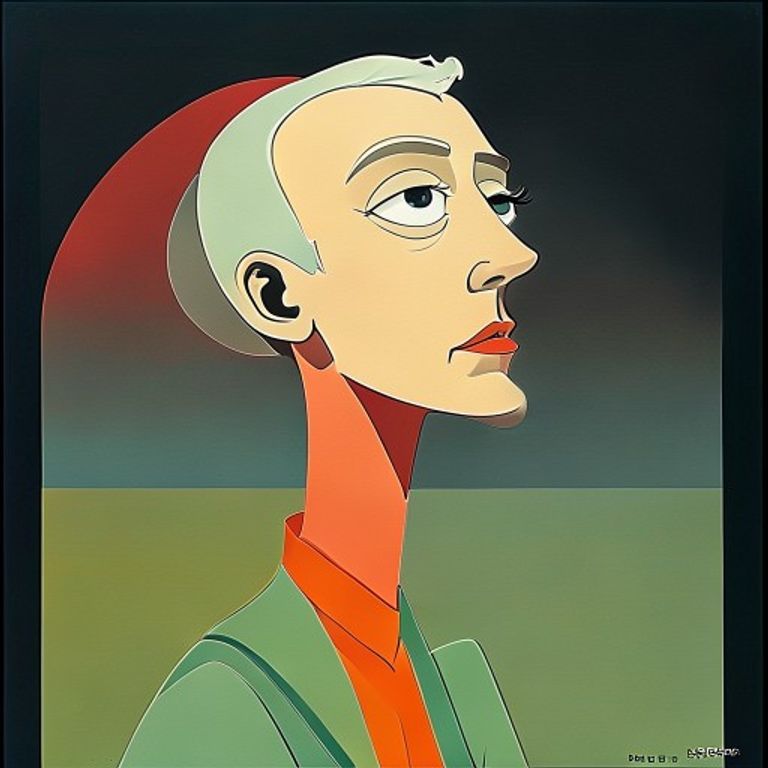
The prompt
Re-render this image as a United Productions of America animated frame from the studio's modernist peak, between 1949 and 1958, in the visual register of Gerald McBoing-Boing (1950), Rooty Toot Toot (1951), and the original UPA Mr. Magoo shorts. Aggressively flat design: figures and backgrounds composed of flat-color geometric shapes (trapezoid head, rectangle torso, triangle legs), the silhouette doing all the character work, NO modeling, NO gradient, NO rendered roundness. Color: chalky mid-century palette of dusty rose, sage green, mustard yellow, brick red, slate grey, ivory cream, applied as flat fills with hard edges. Background reduced to two or three abstract color planes (a horizon stripe, a ground plane, a free-floating sun or moon shape), often with white negative space dominating large areas of the composition, the background a Saul Bass poster rather than a rendered environment. Figure proportions: STYLIZED away from realism, elongated necks, oversized heads or hands, tiny feet, the figure constructed for graphic appeal rather than anatomical accuracy. Line: minimal, often absent, the shapes touching each other directly with no outline, OR a very fine uniform-weight black ink contour added only where two same-tone shapes meet. Composition staged like a magazine illustration of the period (Saul Steinberg in The New Yorker, Mary Blair concept art, Paul Rand poster design), the cartoon openly acknowledging its kinship with mid-century graphic design. Texture: very faint paper-stock grain, slight registration variance between color blocks, the look of a serigraph print rather than a cel. 4:3 academy aspect or wider widescreen depending on era. No on-canvas text, no studio mark, no captions. Preserve the subject, pose, and composition of the source image exactly, change only the medium and rendering.
What it is doing
UPA was founded by ex-Disney artists fired after the 1941 strike. They rebelled against Disney's rendered-roundness orthodoxy by importing mid-century modernist graphic design (Saul Bass, Paul Rand, Bauhaus poster grammar) directly into animation. The UPA cartoon asserts that DESIGN is the character, that the trapezoid head and the empty white background are not constraints but the entire artistic statement. The Disney-Pixar smooth-spherical orthodoxy that dominated 1960 through 2010 is what UPA was against.
Tuning knobs
- Shape vocabulary: `trapezoid head + rectangle torso + triangle legs` (signature) vs `looser organic shape (later UPA)` vs `extreme geometric Bauhaus`
- Color palette: `dusty rose + sage + mustard + slate` (signature) vs `brighter brick + lemon + teal` vs `near-monochrome (Boing register)`
- Background ratio: `60-80% white negative space` (signature) vs `full color-block background` vs `single horizon stripe`
- Outline: `no outline, shapes touch directly` (signature) vs `fine uniform black contour only where same tones meet`
- Composition register: `Saul Bass poster` vs `Saul Steinberg New Yorker cartoon` (signature) vs `Mary Blair concept`
- Era: `1950 McBoing-Boing peak experiment` (signature) vs `1955 Magoo commercial polish` vs `1958 late-UPA decline`
Style lineage
Learn the visual culture this draws from: Where Creativity Works.
Related prompts
See all 7 prompts in the Cartoon grammar · Open in the gallery